
When it comes to capturing the splendour and natural beauty of our world, what's a better choice for an artist is there than the tree? Trees have been an inspiration for artists for centuries; the winding shapes of their branches, their vibrant green leaves, and the gnarly texture of their trunks lend themselves nicely to constant study and artistic interpretation. No two trees are completely identical, they all have individual characteristics that set them apart from one another – different twists and turns, furrows and crevices, leaf and bark patterns, bare branches stretching to the sketch or lush green canopies of forests.
In this article, we'll take a look at how to paint a tree with a limited colour palette using watercolour paints. This is a great exercise for beginner artists. Using only two pigments to create a third colour and diluting your paints to create a variety of light and dark values is an excellent way to study colour theory and learn how to utilise tonal values in your work.
We'll separate this article into three distinct sections to make each step of the painting process more digestible.
In Part One we'll look at the materials and equipment you should use for this project.
For Part Two we'll observe the shapes of trees and learn the mark-making techniques we can use to draw them. We'll also analyse how using 2B and 4B pencils can be used to create light and dark values in our sketches.
Finally, in Part Three we'll look at using warm and cool colour palettes alongside watercolour painting techniques for depicting trees.
Part One: Materials List; What Do I Need to Paint a Tree and Why?
What Colours Are Required to Paint a Tree?
Obviously, to get started with painting trees with watercolours, you'll need, well, watercolours! You don't need lots of different colours to begin with, especially if you're just starting out as a beginner. A limited colour palette is a great way to get started when studying and painting trees.
The colours below are a great example of a beginner's colour palette for painting trees. These colours are often available in watercolour sets, but can also be found individually.
Alizarin Crimson | Cadmium Red | Cadmium Yellow | Lemon Yellow | Yellow Ochre | Ultramarine Blue | Prussian Blue | Burnt Sienna or Burnt Umber | Raw Umber
These warm and cool primary colours, once mixed, will provide you with a good range of secondary and tertiary colour palettes. Using colour charts and practising mixing colours is a great way to learn about how different colours affect one another and how to manipulate shades, value, and vibrancy. If you find that your colours are too vibrant for your liking, you can use small amounts of complementary colours to desaturate and mute your colours (for example, adding blue to orange, red to green, and so on). You only need to add a very small amount of pigment to adjust your colour values. Check out the ARTdiscount Blog article "Word of the Day: 'Hue'" for more tips on colour mixing.

If you're really not sure where to get started, we recommend beginning with a basic watercolour set, as most manufacturers will choose colours that are traditionally by studying artists. For this blog entry, I've used Winsor & Newton's Cotman Sketcher's Pocket Set, as it features 12 student-quality colours in an compact and transportable case with an integrated mixing palette. Though this is a student set, the colours are vibrant and intermixable.
Finding the Ideal Watercolour Paper
There's a few different textures of watercolour paper available, and this will have a great impact on the outcome of your work. Hot-Pressed watercolour paper has a smoother surface, which lends itself more to detail-oriented work, such as portraits. Cold-Pressed (also known as NOT) watercolour paper is sort of the jack-of-all-trades option, featuring a medium-textured surface with a slight tooth that allows paints to sink in slightly. Rough watercolour paper has a highly-textured surface which is noticeably more pitted than cold-pressed paper. Its more uneven surface makes it an excellent option for landscape artists, as it allows for more textural, expressive work.
For organic paintings, we recommend using rough or cold-pressed watercolour paper weighing no less than 200gsm (90lb). If you're just getting started with watercolour painting, paper which is 300gsm (140lb) is generally the best choice. 100% cotton watercolour paper is by far the most reliable to work upon and will guarantee the best results, but an acid-free, archival wood-pulp and cellulose fibre mix is a good, more affordable option for beginners and intermediate artists.
For more information on watercolour paper, check out the ARTdiscount Blog article "Choosing the Correct Watercolour Paper for Your Style of Painting".
Click here to check out the Watercolour Paper Collection on the ARTdiscount website.
What is Masking fluid and What is it Used For?
Masking fluid is a medium that you can apply to retain the white of your paper in certain areas. You can apply masking fluid directly to the paper to protect certain areas from colour washes, as it will resist the watercolour paint. This makes it a great medium to use for retaining bright highlights on branches, leaves, foliage, and bark. If you're applying masking fluid with a brush, you should use older brushes so as not to damage any newer or higher-quality brushes. After using, you should immediately give your brushes a wash in soapy water. You can also use ruling pens, cotton buds, sponges, and dip pens to apply masking fluid.
Masking fluid should be used before painting and be left to dry completely before being worked over. Once your paint is dry, the masking fluid can be removed by lightly rubbing over it with your finger, or by using a soft eraser. If you think the white of your paper is a little too white, you can dilute the pigment in this area and pull it softly into your white shape, which will soften the edges and reduce the brightness.
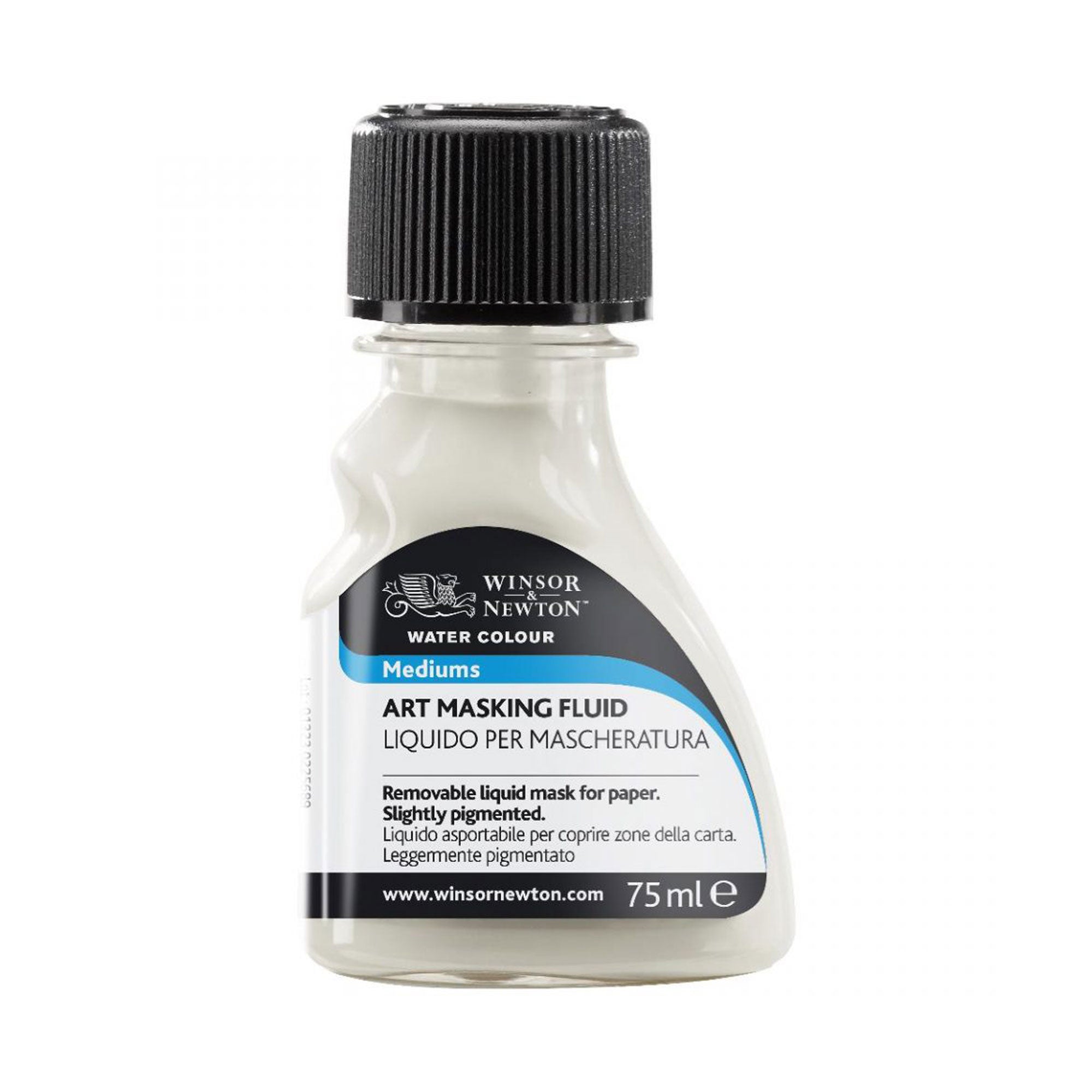 |
Winsor & Newton Art Masking Fluid - Coloured - 75ml
|
Using a Ruling Pen on Your Watercolour Painting
Ruling pens are not an essential tool for watercolour painting, but rather a great option for adding increased precision in areas. Ruling pens are generally designed for fine line drawing, technical drawing, cartography and calligraphy. They can be used for making fine lines and borders in Indian ink, gouache, drawing ink, and with art masking fluid. You can adjust the thickness of your line by turning the metal screw wheel on the side. Simply set the ruling pen to the required thickness and dip lightly in masking fluid. Remember to remove any surplus masking liquid off the pen once you have finished.
What Sort of Pencils Should I Use for Sketching?
2B pencils are a good option for lightly planning out the composition of your painting and illustrating the structure of your tree. Make sure you keep your pencil nice and sharp while working and draw with a light touch. Don't press down onto the paper with two much pressure, as this will create a noticeable indent and make your lines harder to erase. For more preparatory sketches, a softer 4B pencil will be useful to establishing the different values and the structure of your shadows.
Check out the Graphite Pencil Collection on the ARTdiscount website for a wide range of pencil options. All of the pencils available are great for light sketching!
What Kind of Mixing Palette Should I Use for Watercolour?
For watercolours, we recommend using a small ceramic palette to begin your studies. If you have only the primary colours, you'll need to mix various earthy green hues to create your tree colour scheme. Look for mixing palettes with with small sections to place individual pigments and a large space for mixing. Alternatively, many watercolour half pan sets come with integrated plastic mixing palettes in the case, making them a great option for artists working en plein air.

What Masking Tape Can I Use on Watercolour Paper?
You'll need masking to hold your paper in place on its backing board, or to create neat borders around your composition. We recommend using low tack masking tapes so that your paper doesn't rip during removal.
I've Accidentally Put Too Much Water on the Paper! What Do I Do?
Don't panic! Any strong kitchen towel will work for pulling off excess water and paint from your paper, or for soaking up water from your brush. Try to avoid heavily-patterned towels as they can leave their pattern marks on your painting.
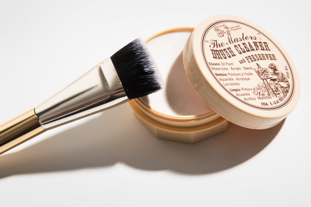
If You Brushes Need a Deep Clean, Soap is Your Friend
Very mild soaps, or brush cleaners like The Masters Brush Cleaner, can be used to gently clean your brushes, which will help ensure their longevity and enable them to keep their shape for longer. You should aim to clean your brushes soon after you're finished working to maintain optimal performance out of them.
Never use boiling water or leave them soaking in water for any length of time, as this will ruin the wooden handle and bend the bristles. Even synthetic brushes can be damaged this way! Always carefully clean your brushes and allow them to dry, storing them with the handle down and the bristles at the top. Brushes can be stored either vertically or horizontally, and a brush case or stand is an excellent way to keep them safe and organised.
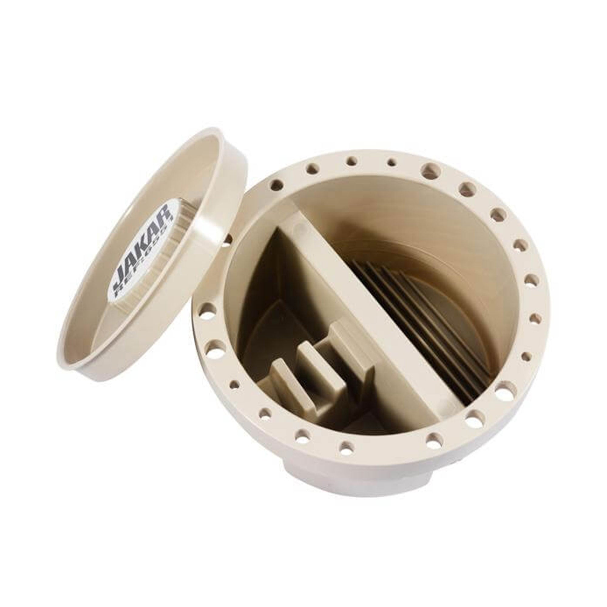
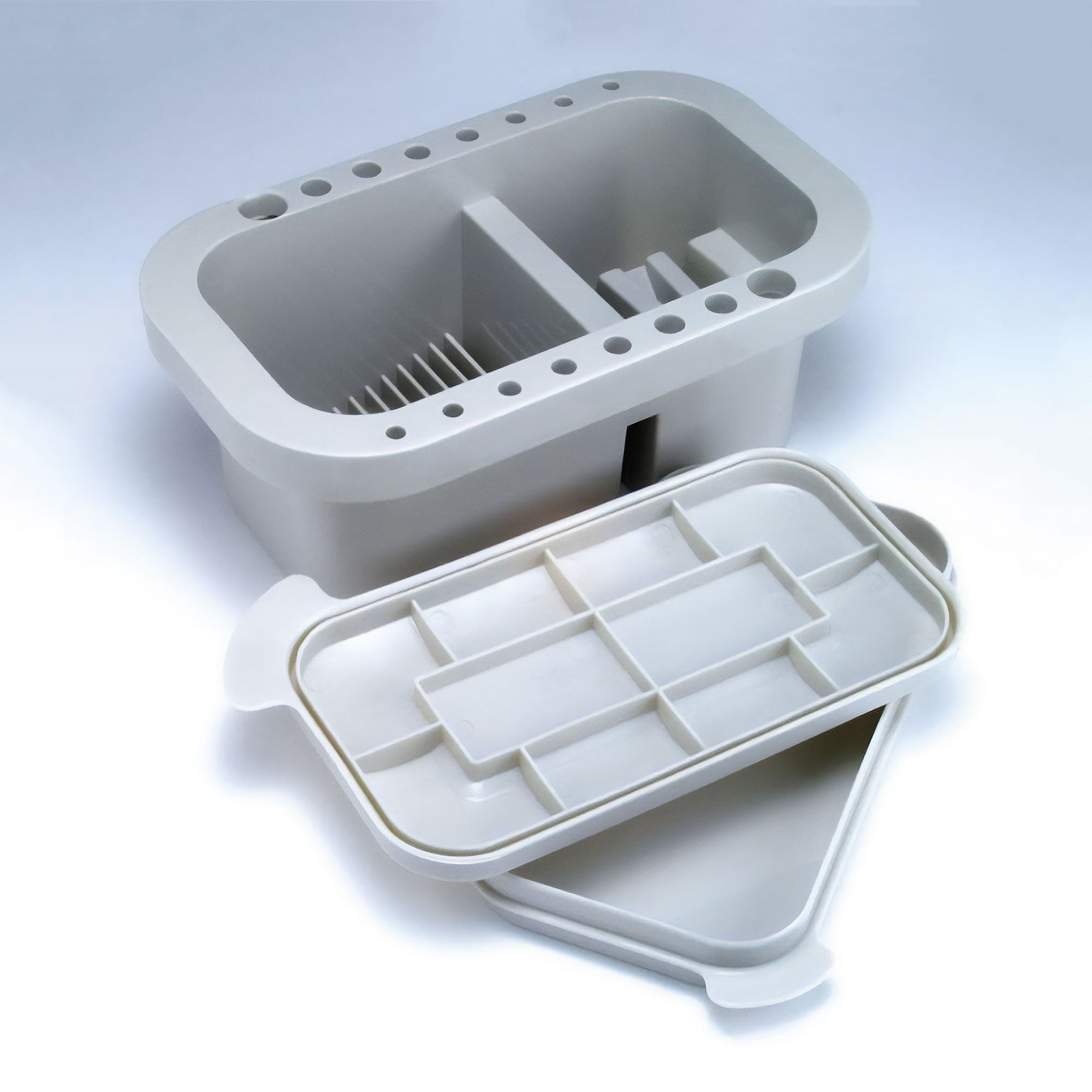
What are the Best Brush Cleaning Waterpots?
 |
|
You should aim to have two water-pots, one for diluting pigments and the other for cleaning your brush. Aim to have a heavy bottomed glass jars for your water so they won't move or be easily knocked over. Change the water often to avoid muddy colours.
What are the Best Sponges for Watercolour Painting?
Small, natural sponges are amazing for creating unique textural qualities in your paintings. Dry-wall details, rocks, sand, foliage, leaves, bushes, and tree canopies can all be created with these small sponges. Work your textures by starting with a highly-diluted light texture, then build up your layers adding more pigment to the water to darken your paint. Work light to dark and then you will always be in control of your image. You can work wet on wet for a more softer effect.
What are the Best Erasers to use on Watercolour Paper?
A good clean eraser that doesn't mark your paper is worth having in your toolbox. They're useful for taking out graphite and charcoal marks, while also great as a drawing tool for doing your initial sketching prep. With them, you can create tonal shifts and highlights on your tree's bark and foliage.
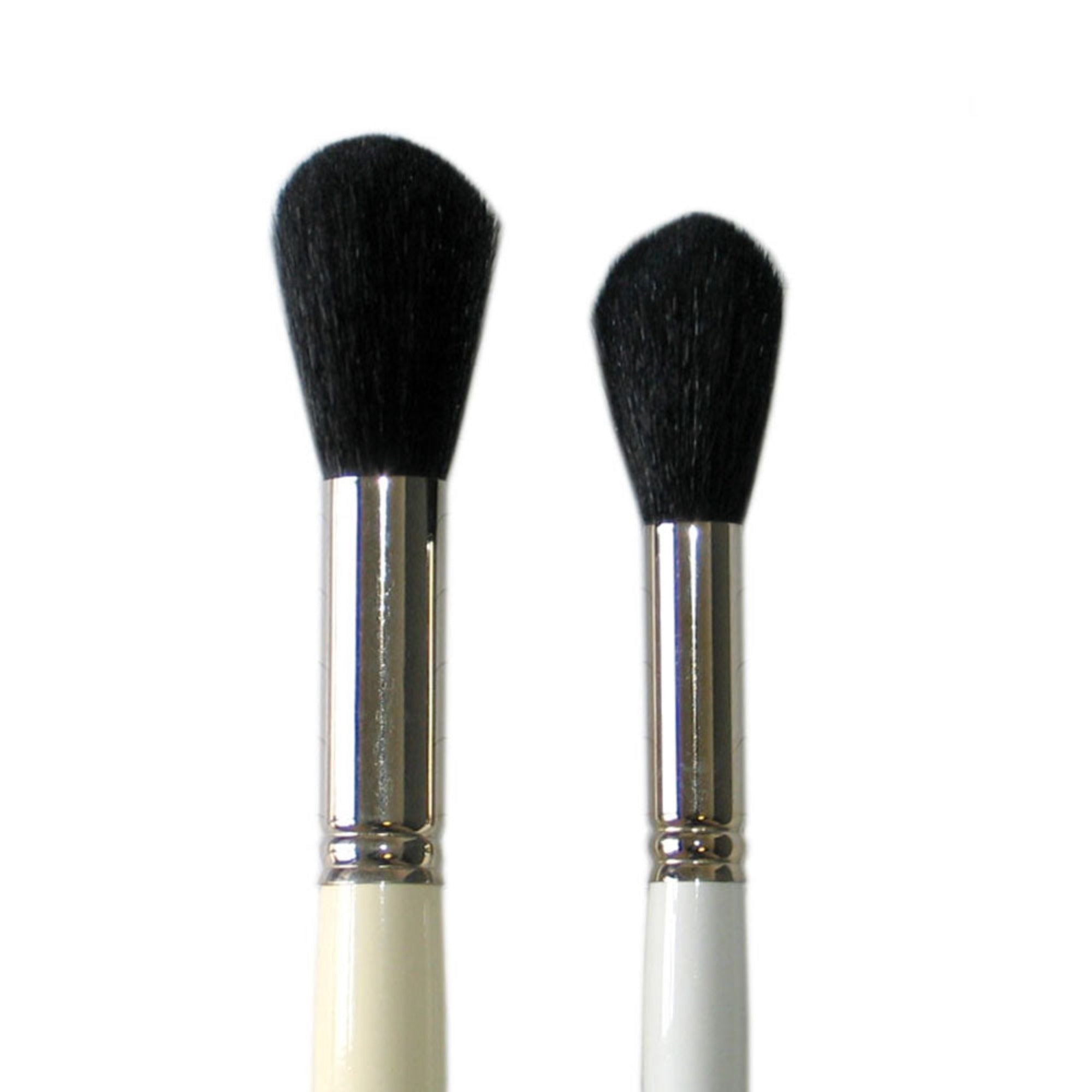
The Big Question: What are the Best Brushes for Watercolour Painting?
Before anything else, here's one very important tip; always keep your watercolour brushes separate from your oil or acrylic brushes. Your watercolour brushes should only be used for watercolour painting.
Many professional watercolour artists use sable brushes for their work. Sable is renowned for its ability to hold water and pigment, and is great for creating smooth gradients and transitions on watercolour paper due to its softness. Thanks to its ability to hold shape, sable is also loved for adding fine details into work. The key drawback of sable is that it's often more expensive than other brush options. Therefore, we recommend that beginner artists look for more affordable brush options with blended brushes featuring both natural and synthetic hairs.
Another key drawback of sable is that due to the use of animal hairs, it is unsuitable for vegan artists. Fortunately, there are many synthetic bristle alternatives on the market that mimic the qualities of animal hair brushes, keeping their point, shape, spring. Synthetic brushes come in a variety of shapes and softness for watercolour painting.
We recommend starting out with a good selection of sizes and shapes, which will allow you to create a range of details and textures. You should always have several brushes at hand, see below for animal hair and synthetic hair watercolour paint brushes available.
If you are a beginner aim to invest in; a mop brush, a filbert, a fan brush, a several size round brushes, a flat brush and a rigger brush.
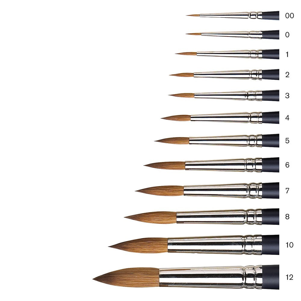
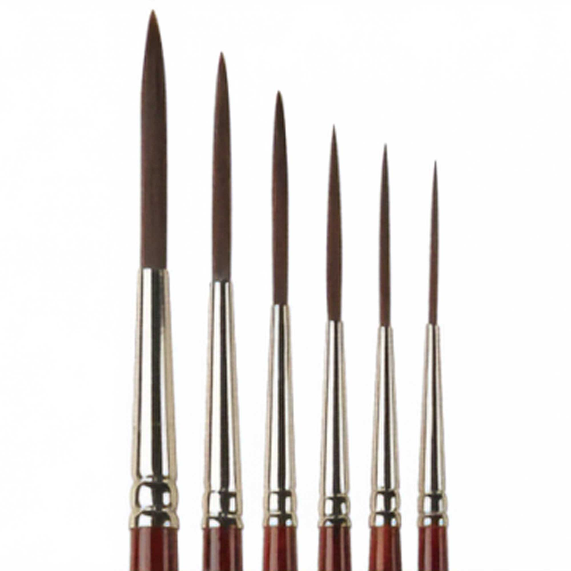
How Can I Use My Round Brushes?
Round brushes are found in many different sizes and are an extremely versatile option for painters. Larger round brushes (such as sizes 10, 12, and 16) can be used for creating broad areas and strokes of colour, making it ideal for skies, sweeping landscapes, horizon lines, painting large tree trunks, and creating washes for the wet-on-wet technique.
Smaller brushes (like 0, 1, 2, and 3) are ideal for linear detailing and outlining, while medium brushes (such as 5, 6, 7, and 8) are great as general all-rounders! The most cost-effective options are the beginner sets as listed below, however there are many synthetic and Sable brushes you can purchase individually.
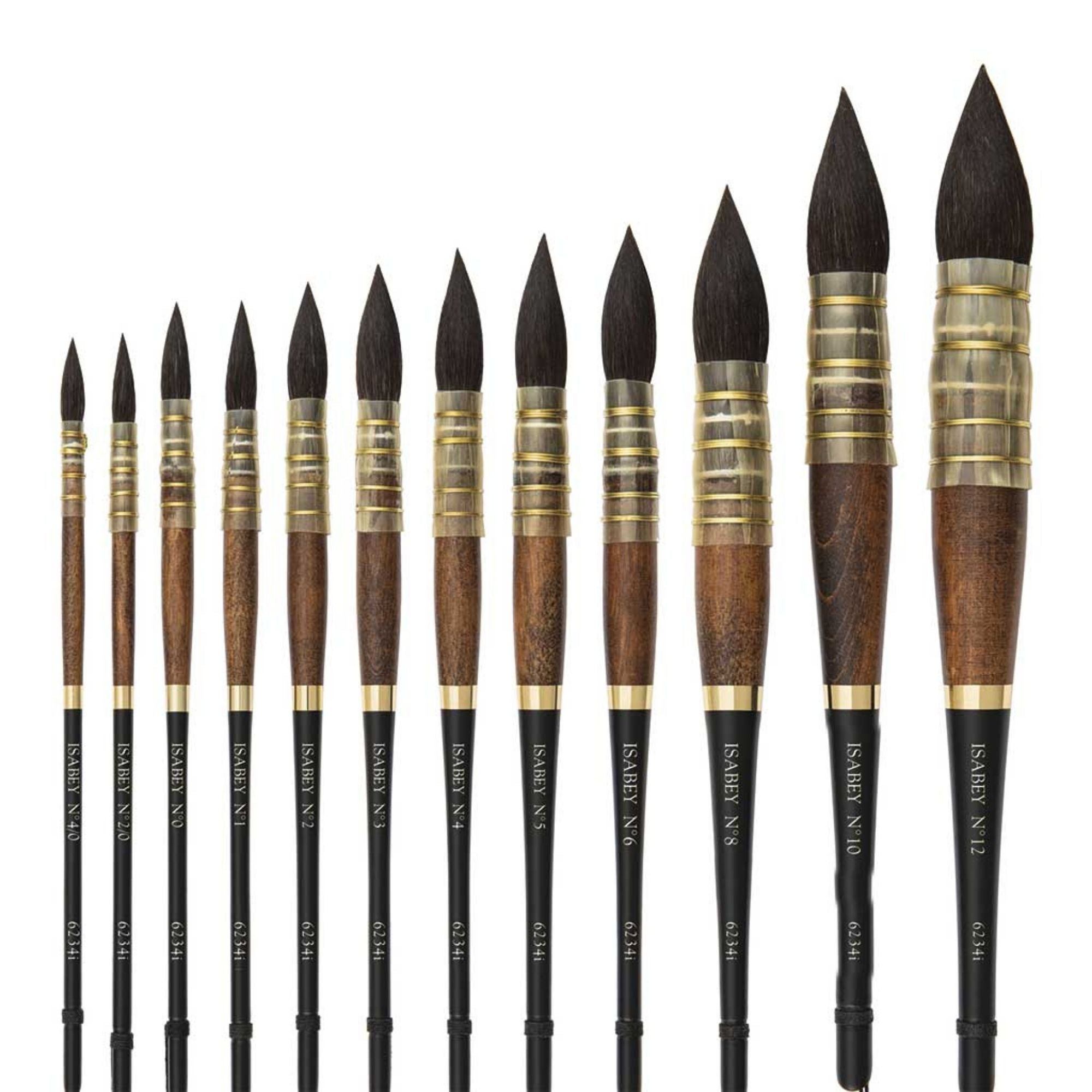
Round Brush: Synthetic;
 |
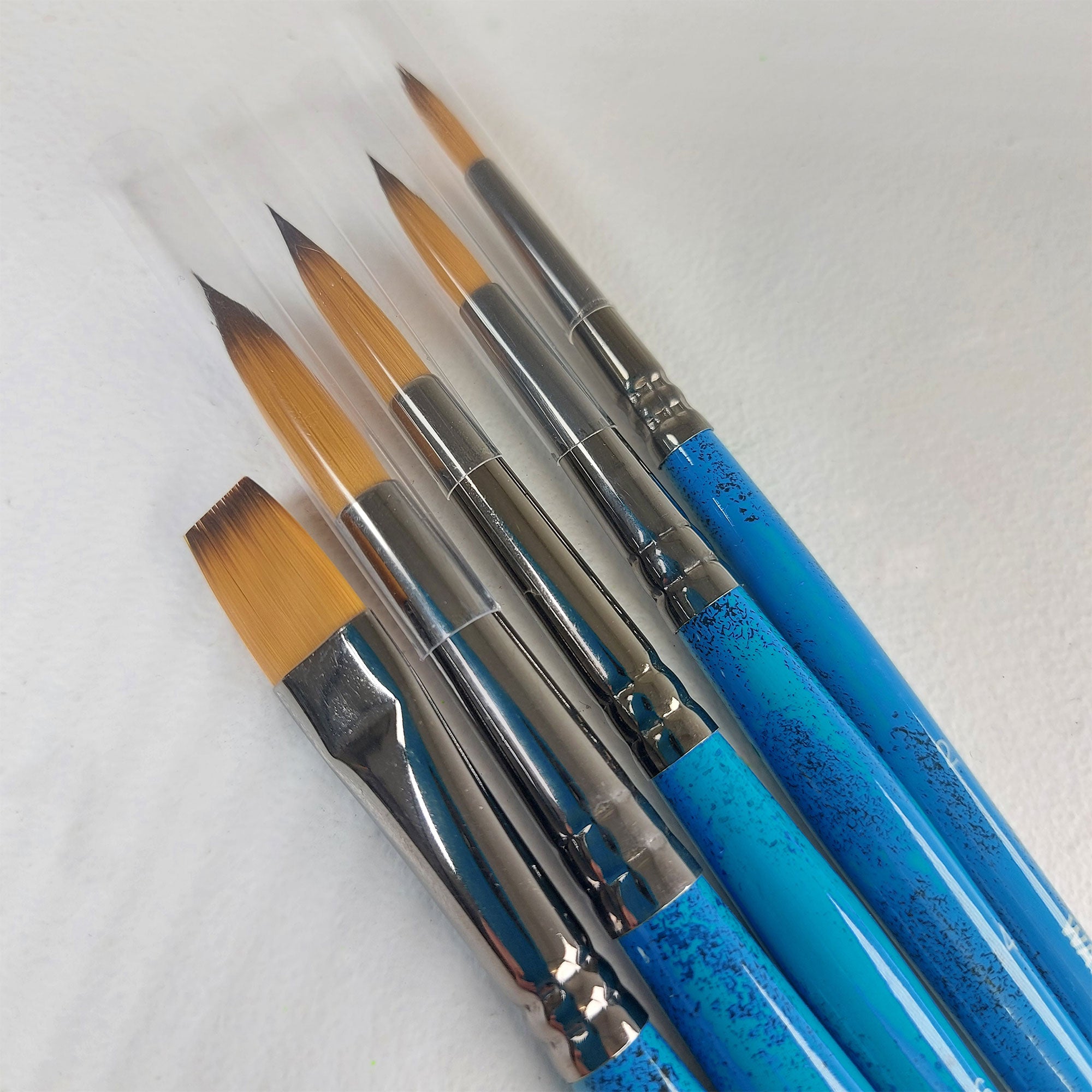 |
- ARTdiscount Pro Watercolour/Gouache Round Brush Set of 8.
- Pro Arte Sablene Brushes - Round - Series 110 - Individuals
- 1 ARTdiscount SAMPLE Watercolour Brush Set of 5 Brushes
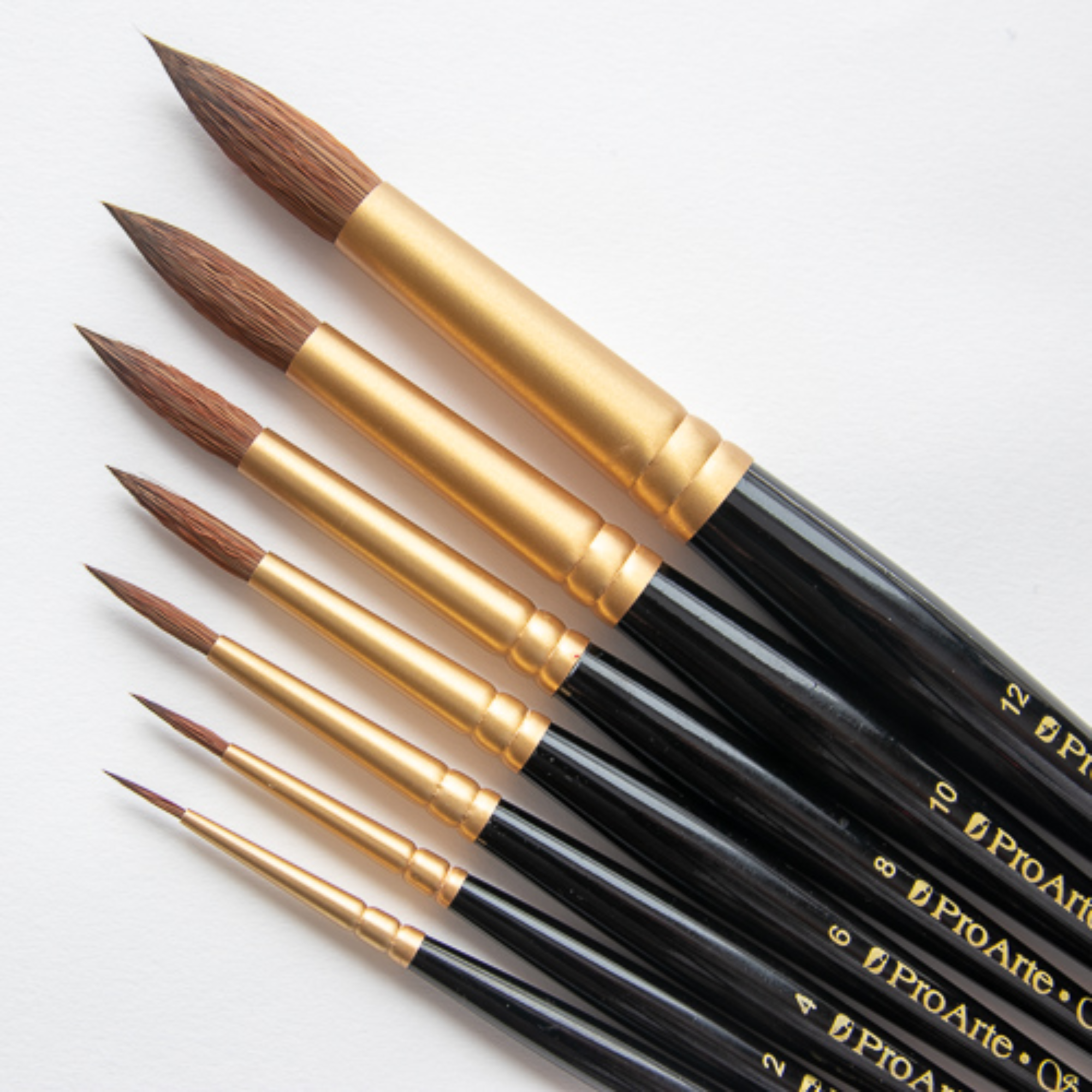
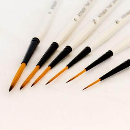
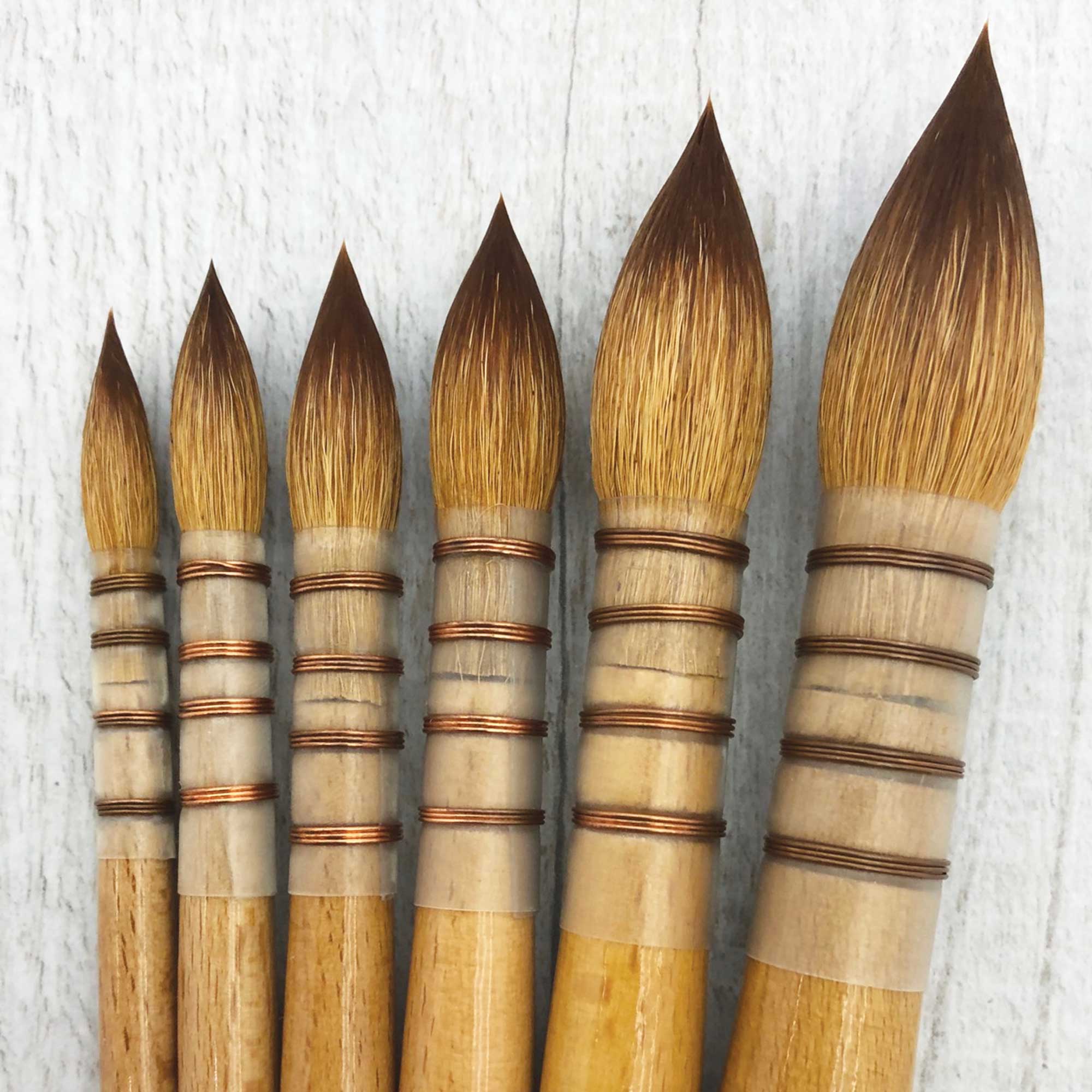
Round Brushes: Sable; (the brush of professionals)
W&N Artists Water Colour Sable Brushes Round size 00
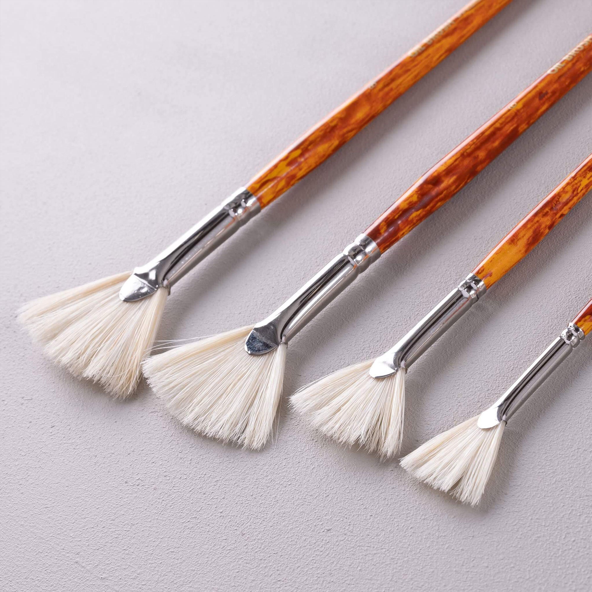
What is a Fan brush used for?
Fan brushes are really useful for creating textural foliage, leaves, and grasses. Used with the dry brush technique, fan brushes will allow you to create bark textures, debris, stone textures, soil, and sand textures. Techniques used would be doting pigment, directional flicks or lines, small dabs, or dragging with a dry brush horizontally and vertically. Great for long and short grasses and distant textures.
ARTdiscount Bristle Brushes - Fan
What are Rigger brushes used for?
Rigger brushes are used to create long linear lines, such as branches, twigs, texture for long tree trunks, long blades of grass, or distant thin spindly tree trunks. They are great for linear detailing vertically or horizontally.
Rigger Brushes: Synthetic;
|
 |
Rigger Brushes: Sable;

What are Mop brushes used for?
Mop brushes are great for wet-on wet-techniques, laying down large wash areas, sky, fields and thick tree trunks. Acts like a Sable brush but fully synthetic. Available in various sizes. Mop brushes will absorb a lot of watercolour, water and inks, used for large areas.
Sablesque Blended Mop Brush - Series 45 no 3/0
Mop (Fine Goat hair) and Wash Brushes: (Squirrel)
Excellent spring and responsiveness, excellent pigment and water retention. Great for large and small wash areas, sky, fields and thick tree trunks. Available in various sizes.
Series 50 Kazan Squirrel Artists Wash Brush Small
Pro Arte Series 320 - Mop Brushes medium
For more information on brushes, check out the ARTdiscount Blog article "A Beginner's Guide to Paintbrushes".
Part Two: Drawing and Sketching Your Tree
So, you've got your pencils, you've got your brushes, you've got your paper, and you've got your paints. Now it's time to get started on your painting. Before committing any paint to paper, you should start by sketching out your composition.
A great deal of planning and preparation goes into a serious commission. As a beginner, employing the same strategies as a professional artist will enable you develop your skills quicker. The first task is to sketch out the shapes and textures of your painting, and to experiment on a loose sheet of paper to work out your colour scheme. Going out into nature and sketching trees en plein air is a great way to understand the forms they can take from first-hand experience. However, with temperamental weather and the shifting of the sun throughout the day, it can be quite difficult, so another great option is to take your own photos of interesting trees and create quick thumbnails based off these in your sketchbook. First draft is not always best draft, so we recommend illustrating at least nine thumbnails to help you find the best composition.
Creating a good collection of clear images and illustrating a number of sketches will help you to think about your painting's themes and composition. Rehearsing shapes, values, and textures in pencil before you commit to the paintbrush will ensure that your work has the sense and likeness of your subject. Start by concentrating on a single tree rather than working on a whole forest. By rehearsing the lightness of pressure use with your pencils, you'll develop more control when it comes to painting with watercolour brushes. Always try to use only light-to-medium pressure.
When Working From Photos, Here's a Few Things to Consider
First and foremost, establish which direction light is coming from. Lighting coming from either side of the will allow you to establish more form and texture in your painting when compared to light hitting the tree straight on or above.
Use a soft 2B or 4B pencil to lightly trace out the structure of your tree's trunk, then work on the direction of the branches and twigs. Ensuring that you use a soft pressure on the paper, draw the branches thicker towards the trunk of the tree and allow them to taper out in an upwards direction towards the sky as they get further away. Some of the branches will disappear within the tree canopy, only to reappear again thinner and smaller nearer the top of the tree.
Once your tree structure is lightly pencilled in, look at the shape of the foliage; at this stage you're only looking at the shape, not each individual leaf. Consider where the darkest values are and create darker shading with the side of your pencil. Then, look for the mid-tone values and and use a lighter touch with your pencil to shade them in. Lastly, leave the lightest values to where the direction of sunlight will fall on your tree.
The darkest values will primarily be around the underside of the foliage canopy and on the tree trunk, however some of the branches nearest the trunk will also share a darker value. You should leave some areas of the trunk and surroundings in a mid-tone and some areas light, which will indicate the dappled sunlight falling through the leaves.
Look at the different textures and marks on your foliage canopy, aim to create soft scribbly marks to describe the direction of the leaves without drawing each leaf.
If you have a large, thick trunk, look at the different linear marks and patterns. Use small marks and longer ones to imitate these. Dots, dashes, crosshatching, and even small scribble marks can be used to familiarise yourself in translating what you see.
If it helps, make little notes of your observations and analysis on the page. This will make it easier to remember when you commit to your watercolour painting. Make lots of little drawings investigating these individual characteristics.

Part Three: Warm & Cool Colour Palettes and Watercolour Techniques
Once you've spent some time studying and drawing your chosen tree, you'll have become familiar with its shape, understood its texture, and captured where the dappled light falls. Depending on the time of year, you'll want to choose a different colour palette. If your tree is bare with no leaf canopy, it's most likely a winter tree. Because of this, the light will be greyer, and you'll want to choose a cooler colour palette to capture the mood. However, if your tree has a little bit of foliage, or a full canopy of leaves, it's more likely to be from the spring or summer. For this, a warmer palette with lush greens and earthy browns is the right choice for you.
For the first two studies, I have used only two pigments for each painting, which will help illustrate just how easy it is to depict a tree and the mood of the scene with a limited palette.
The third study has been painted using all four colours. You can come up with your own two colours to work with, so long as one is greener in hue and the other is a brown or red. These complimentary colours provide a good base for earth and neutral tones. These limited palette exercises are just to get you started; once your confidence levels have improved, you can use any palette of your choosing.
However, a good rule to follow would be not to mix more than three watercolour pigments, otherwise your results may become muddy or grey. The more colours you mix, the less vibrant they become. If you need to darken your image, you can just lay the same pigment over the top using the wet-over-dry technique. To lighten, just remove with a clean brush or paper towel.

Fig 1 - Tree trunk image, no leaves, using Burnt Umber and Viridian Hue to make a third colour of Dark Olive Green.
Using a very diluted mixture of this third "Dark Olive Green" colour, I lightly painted the trunk and then the branches. Working light to dark, layers of paint were added to create bark detail and texture, roots, and cast shadow. As the branches reach up to the sky, they become lighter in appearance. The branches also taper off into smaller branches and twigs. The lighter you paint using this palette, the further in the distance the tree looks. Also, you could add snow to the branches and under the tree to further enhance the winter feel.

Fig 2 - Tree trunk, no leaves, using Indian Red and Sap Green.
This is a much warmer palette, which gives you the impression of a pleasant spring's day after a long winter, or of the sun rising and setting. Again working with just two colours to create a very diluted Warm Olive Green, the trunk was painted first using a very diluted pigment, then mixes of the pigments in various proportions and dilutions were used to suggest form and texture. Keep a dark value under the branches and at the base of the trunk.

Fig 3 - This last tree with no foliage was painted with all four colours. Indian Red, Sap Green, Viridian Hue and Burnt Umber, plus the cool Dark Olive Green and the Warm Light Olive Green.
For this image, I worked light to dark, wet paint on dry paper, working in layers. Where the sunlight hits the trunk or branches, the pigment was removed to lighten the area. To remove pigment off your paper, just paint over the area with a clean wet brush and stroke the pigment off with water. You can also wet the area with water and pull the pigment off with a tissue. By working light to dark and introducing a variety of light and dark colours you can very easily suggest a 3 dimensional form. Add a few dots to suggest bark formations and texture.

Fig 4 - Texture for foliage created using a sponge to apply pigment.
First, mix Burnt Umber and Viridian Hue pigment to create a Dark Olive Green. Apply a very diluted dark Olive pigment to the sponge and apply wet sponge to dry paper. Don't use too much pressure to apply pigment. Once dry, take a more pigmented Dark Olive Green, mix and apply a darker layer over the more diluted Dark Olive Green, working the sponge in small areas to give the effect of foliage. Leave some areas more open towards the top of the foliage and darker and denser underneath.

Fig 5 - A warmer palette for this foliage example. Using the same technique as in Fig 4.
Apply a very diluted mix of pigment and let it dry, then work different variants of greens made up of Indian Red and Sap Green over the diluted areas to give the impression of dense and light foliage. Remember which direction the light is coming from. Leave some areas open towards the top of the foliage and darker and denser underneath.
Fig 6 - Cool Tree with foliage using Burnt Umber and Viridian Hue.
The trunk was painted first using the techniques detailed in Fig. 1, then foliage was added with a sponge, a light and diluted technique first then adding more pigment working light to dark.

Fig 7 - Warm tree with foliage using Indian Red and Sap Green.
The foliage was sponged onto the paper first for this tree painting. A light diluted touch first and fairly spaced out. Then a darker more pigmented sponge technique was applied, creating dark values to suggest volume and shape of the foliage. Using a brush I painted in the small branches in the gaps of the foliage working down from the top and meeting at the trunk of the tree. I used light Olive Green to paint the trunk then painted darker values to suggest 3 dimensional form and texture.

Fig 8 - This final tree was painted using all four pigments Burnt Umber, Viridian Hue, Indian Red, Sap green and their light and dark Olive greens.
The trunk and branches were painted first using a diluted pigment, then adding more pigment and colours to suggest sunlight and texture. The pigment was semi dry in between applications of paint so some colours softly blended together on the paper. A sponge was used again to apply the foliage working exactly the same as before, diluted light colours first then more pigmented added under the light areas to suggest shadow and form.
Some Additional Techniques You Can Use;
- Wet on wet - wet the paper first before laying down pigment, either with a sponge or brush, whilst still wet drop pigments into the area and they will bloom and diffuse creating a soft variegated effect.
- Dry brush - using a semi-dry round brush with a full pigment load, drag the pigment down the dry paper using the side of the brush. This will create a textured effect, especially on rough or cold pressed watercolour paper. Great for bark effects when painting trees.
- Wax resist - using a coloured or white wax crayon, lightly draw a few marks, dashes and broken lines on the paper first, add watercolour over, diluted or full pigmented.
- Masking fluid resist - using a brush, sticks, cotton buds or sponge, dipped into the liquid mask, apply the masking fluid where you want to retain the white of the paper. Wait for this to dry before applying pigment over the top. Once painted wait for pigment to dry before removing the dried liquid mask.
- Use a fan brush to apply texture, for grasses, foliage and leaves. Dabbing and dragging techniques.
- Use a rigger brush for fine line details such as twigs and grasses and adding texture to bark when painting trees.
- Using a mop brush for large wash areas, dropping pigment onto the wet paper or for creating gradients, pulling pigment across the paper diluting more to create a lighter colour.
- Scoring into the paint to create texture (Sgraffito). Paint the pigment, wet on dry paper, using a toothpick, or the end of your brush score into the wet paint to create your desired texture.

Time to Start Branching Out!
We hope this leafing through this article has twigged your sense of inspiration to start exploring the foliage-filled world of trees! They're a great way to practice a wide variety of watercolour techniques, expand on your sketching skills, and study colour theory. If you're looking to get started, we have a great range of top-quality watercolour painting supplies for less on the ARTdiscount website.


1 comment
Very comprehensive tutorial. Fantastic.