
Pictured in the Banner: A Philosopher Lecturing on the Orrery, Joseph Wright of Derby, Oil on Canvas, 1473mm × 2032mm, ca. 1766
Tonal Value plays a huge role in giving your artwork a strong sense of depth and form. Put simply, the term refers to the lightness or darkness of a colour. Without a good understanding of value, artwork can appear flat, formless, and lifeless. In fact, many professional artists consider tonal value to be the most important element when it comes to composing their work.
However, tonal value is just one of the key visual components artists should study. In fact, it's a member of a much larger family which we call the "Seven Elements of Art". These elements can be used in conjunction with one another to create all kinds of visual art, such as paintings, illustrations, drawings, photographs, graphic design, and more.
In this blog, we'll explore the Seven Elements briefly, before looking more in depth at tonal value and the pivotal role it will play in your work.
What Are The Seven Elements of Art?
As stated before, the Seven Elements of Art are a family of techniques that artists should study and consider when creating artwork. These techniques are made up of the following; Tonal Value, Line, Shape, Colour, Space, Form, and Texture.
The Seven Elements are the fundamental components in which we create the illusion of space and form, movement, or pattern on a two dimensional surface. They're also the means in which we describe or critique all art forms.
Before closely examining tonal value, we'll take a look at the other six elements first.
Line

Pictured Above: Study of head for Leda and the Swan, Leonardo da Vinci, Black Chalk, Pen and Ink, 1506
Line is defined by a point moving in space, usually where its length is greater than its width. A line may be two or three dimensional, descriptive, implied, or abstract. It can be broken to imply texture or pattern, curved and languid to suggest a shape or movement, and horizontal, vertical, or diagonal to suggest structure, geometry or simply define a form.
Line is used to create a structure for your composition, or it can be used as a foundation for your drawing studies, sketches and paintings. Line is often used in sketching as a preliminary rehearsal and tool to study a subject before the painting or final drawings begin. Many artists will begin with drawing studies using line to describe their subjects. Altering the quality of a line can create a descriptive story.
Above is an example of one of the greatest artists and draftsmen of all time; Leonardo da Vinci! Da Vinci studied several fields of science, including anatomy to better understand the structure of the human body, bone structures, muscles, veins, and skin. He also studied physics to learn how the light reflects off a subject, and he studied chemistry to create the perfect paints.
Observe how da Vinci uses line both to describe defined edges, such as the model's nose, and to give the illusion of form, which can be seen most clearly around the neck. Da Vinci filled more than seven thousand notebook pages with his sketches and notes. The power of his observation and thoughts has been captured on paper and, luckily for us, saved for future generations to marvel at!
Shape

Pictured Above: Flowers, Andy Warhol, Acrylic and Silkscreen Ink on Canvas, 1970
© 2012 The Andy Warhol Foundation for the Visual Arts, Inc./Artists Rights Society (ARS), New York.
Shape describes an element of art that is two-dimensional, flat, or limited to its height and width – usually but not always defined by lines. They can be organic and come from nature, geometric with names such as square, circle, rectangle, triangle, and so on, or they can be totally abstract and amorphic in appearance.
Andy Warhol transformed an ordinary botanical photograph into a series of monumental silk screen images. His clever use of flattened shapes created a repeat pattern across the ten large canvases when viewed together. Changing and developing different vibrant colour ways he created a technicolour series of prints.
Form

Pictured Above: Still Life Pitcher and Fruit, Paul Cézanne, Oil on Canvas, 43.2 × 62.8 cm, 1894
Form define objects in space. Forms exist in three dimensions, with height, width, and depth. Sculpture and architecture has an actual form, whereas two dimensional pieces, such paintings and printed images, can have the illusion of form when the artist uses techniques such as perspective, texture, or value scales to model a form.
Paul Cézanne sculptured his painted forms with directional brush strokes, daubs of paint, and the use of value in colour. It is clear to see his deliberate brush strokes building up his almost geometric shapes.
Space

Pictured Above: Christina's World, Andrew Wyeth, Egg Tempera on Gessoed Panel, 81.9 × 121.3cm, 1948
While actual space is three dimensional, space in a two dimensional medium, such as a painting, drawing or photograph, refers to the feeling of depth or illusion of dimension. Space in a work of art can also refer to the artist's use of the area within the picture plane.
The area around the primary objects in a work of art is known as negative space, while the space occupied by the primary objects is known as positive space. Negative space is always a huge consideration to the artists when creating the composition. Space in surface pattern becomes an integral part of the design.
Andrew Wyeth was a master of creating space in his vast desolate landscapes. Within the painting 'Christina's World' Wyeth uses an elevated horizon, with small distant buildings and a wide open painted meadow to depict space around the central figure. The proportion of negative space around the figure provides us with an emotional and visual tension. We can make up our own narratives for this image or as Wyeth's wife described the painting as more of a 'psychological landscape' than a portrait, 'a portrayal of a state of mind', rather than a place. Anna Christine Olsen was actually Wyeth's neighbour who suffered from a muscle wasting condition, but refused a wheelchair.
Texture

Pictured Above: Bouquet of Flowers, Odilon Redon, Pastel on Paper, 80.3 × 64.1cm, ca. 1900–1905
Texture refers to the tactile quality of artwork. This tactility can be both physically three dimensional and two dimensional, where it is implied by your medium, surface, and mark making style. This can be achieved by varying the length of your brush strokes, breaking up line, working with impasto techniques when using paints, and more.
In the above illustration, Bouquet of Flowers by Odilon Redon, the artist uses various techniques to depict the range in textures of the flowers, vase, and background. For the background, Redon uses the long edge of his pastels to create broad marks that accentuate the texture of the rough texture of the paper.
Colour

Pictured Above: Nataraja, Bridget Riley, Oil on Canvas, 1651 × 2277 mm, 1993
© Bridget Riley. All rights reserved.
There are three different components to colour. First is Hue, which is the name of the colour. Next is Intensity/Saturation, which refers to the quality of brightness and purity, or richness and vividness. High intensity would mean the colour is bright and has a strong saturation. Low intensity would mean the colour is dull and faint. Lastly is Value, which we will explore more soon. Value dictates the hue's lightness and darkness, a colour's value changes when white or black is added, also when other hues are mixed this may alter the value.
In Bridget Riley's painting 'Nataraja' 1993, we see Riley using complex colour relationships. 'Nataraja' is a term used in Hindu mythology, which means 'Lord of the Dance'. Contrast, proportion, value and saturation is very carefully considered and planned out for each hue, creating a visual dance on canvas.
So, After All That, What is Tonal Value?
'Value' or 'Tonal Value' is the lightness or darkness of tones or colours. The luminance or luminosity of a colour. All hues can have a value scale from dark to light. Some pigments like Zinc White are already classed as having a light value, whilst other pigments such as Mars Black are classed as having a dark value. Lightening the Value of a colour would entail adding a white pigment to the original hue, this is called a tint, adding a lot of white would render the colour cooler and turn it into a pastel colour.
Let's take another look at the artwork we displayed before, this time with only the tonal values.

All of these artworks depict a strong understanding of tonal value. With da Vinci's linework, he uses hatching to build up dark values in the model's hair and the shaded part of her neck. Warhol uses contrasting mid-tones and highlights against the dark background to accentuate the shape of his flowers, while Cézanne uses light and dark values to build up the form of his still life study. In Wyeth's painting, the light pink of Christina's dress and her raven black hair are juxtaposed by the almost uniform mid-tone of the wheatfield. Redon's flowers are almost all mid-tones, with colour being used to differentiate one flower from another. However, he does make use of lighter values for certain flowers, which allows them to leap out in the composition. Riley's use of varying tones accentuates the feeling of the painting dancing across the canvas, and helps display certain areas where she breaks the pattern for visual interest.
Some would argue that value is more important than colour as value can be used to create a focal point within a painting or drawing. This is achieved by painting a light value against a dark value. It can also create the illusion of depth by using a gradation of value to describe distance; darker in the foreground and lighter in the distance. Within a composition, areas of light and dark give a three dimensional illusion of form to an object or multiple forms.
To darken the value of a colour or hue, you could add black. This is known as a shade. Alternatively, you can add grey to a hue, which typically dims the original colour and can possibly alter its value, but not always. This is called a tone. Sometimes, simply mixing one colour with another is enough to change the value. A little test you could do to develop your understanding of value would be to create a 12 colour wheel chart, and then photograph it. In your phone's editing settings, or by using software such as Photoshop, you can then desaturate the image until it is just black and white, which will help you understand the underlying value your colour has without changing or altering its original value.

A colour wheel created using primary colours with secondary and tertiary hues made via mixing, and then a desaturated version of that same colour wheel. Note how the yellows are higher in value, while the violet is much darker.
There are other ways to adjust the colour without necessarily altering the value. As mentioned before, adding grey to a hue will alter the intensity of a colour, but not necessarily alter its value. Adding grey is usually referred to as creating a tone. Adding complimentary colours to one another will neutralise the colour and alter the hue – and possibly the value, depending how much you use in proportion to each other. For example, if you add a small amount of blue to an orange pigment, you will get a slightly darker orange. If you add a lot of blue to an orange pigment, you will create a dark brown and with a darker value. Creating tonal value charts before commencing a painting can be invaluable in ensuring the success of the composition.
White is the lightest value in a painting or photograph, and black is the darkest. The value halfway between these extremes is called middle grey. Value is best understood when visualised as a chart or a gradient scale. A gradient scale usually illustrates a subtle change of values gradually moving from light to dark or dark to light.

Value can be totally independent of hue. Many oil painters and visual artists begin their paintings using a 'Grisaille' method, where the entire painting is done entirely in values of grey first. Hues are added to the painting in glazes over this underpainting. Some artists will create a monochromatic underpainting purely to map out the values within the composition first. This kind of preparation can ensure that your composition has a balanced light and dark value range.
A painting, photograph, or drawing can have an infinite degree of tonal values, rendering a subject three dimensional and providing more detail. Alternatively, an image could only a few tonal values, or even just the three key values; high key, mid tones, and dark values. Fewer tonal values will render the subject more illustrative, rather than photo realistic. Many artists work with only three tonal values at first, but will gradually add more once the initial values are strong.

Pictured Above: Guernica, Pablo Picasso, Oil on Canvas, 3493 × 7765mm, 1937
In the anti-war masterpiece, 'Guernica', Pablo Picasso depicts in great detail a bloody attack using stark values of black, white, and shades of grey. The visual impact is shocking and thought provoking, with no red paint used or needed to explain the atrocity.
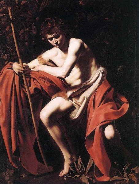
Pictured Above: John the Baptist (John in the Wilderness), Caravaggio or Bartolomeo Cavarozzi (disputed), Oil on Canvas, 169 × 112cm, ca. 1598
Using value in art can create the illusion of a strong light source, both in its direction and its intensity. Using a dark value placed directly against a light value in a painting can create a strong contrast, which is a major part of a technique known as Chiaroscuro. The Master artist Michelangelo Merisi da Caravaggio favoured this style of painting to highlight drama and realism in his famous paintings. Beautifully contrived, his paintings didn't always depict the world in a naturalistic way, but were a revelation in style and dramatic illumination.

Pictured Above: A Philosopher Lecturing on the Orrery, Joseph Wright of Derby, Oil on Canvas, 1473 × 2032mm, ca. 1766
The above painting by Joseph Wright of Derby – the full name of which is "A Philosopher giving that Lecture on the Orrery in which a lamp is put in place of the Sun" (concise, I know!) – is another excellent example of chiaroscuro in use. In this painting, the light source is placed at the centre of the composition, casting bright highlights on the subjects facing the viewer, and shrouding those facing away in darkness. This gives the viewer a grounding in the image's reality, and makes them feel like they too are part of the composition, enraptured like the children and students alike at the model solar system and the Newton-like lecturer's vast wisdom.

Pictured Above: Water Lilies, Claude Monet, Oil on Canvas, 89 × 100cm, 1905
There are also many paintings that primarily use less contrasting values. Claude Monet famously created many works of art painted with a colour palette composted of similar values, such as his iconic Water Lilies series. In this one from 1905, we see the colours are vivid and rich in saturation but they are all mostly the same value. Proving a tapestry of rich painted hues work effortlessly and in harmony with each other.
Monet's understanding of light and dark values, shades, and subtle low contrast values, work to create the illusion of light kissing every part of the canvas. A full range of low key values that actually identify light!
What is a Value Scale?
A value scale is a way of describing how values change between black and white. The most common scale used today was developed in 1907 by Denman Ross, a professor of art at Harvard University. It's also known as the Nine Step Value Scale. This scale uses nine shades of the same hue (or a monochromatic black to white) which are labelled from darkest to lightest. Each step is designed to increase incrementally, while still being easy to differentiate from one another.
How to Create Your Own Denman Ross Tonal Value Scale

This scale is an extremely helpful tool for visual artists and painters who wish to identify and plan to include specific proportions of light colour values, mid-tones and dark values within their compositions. If working from a colour photograph, desaturating it to turn it into black and white will allow you to identify the different values. Taking black and white photographs of your work as you progress through your painting will also help you identify the correct tonal ranges.
Values that are referred to as High Key Colours are those nearest the lightest part of the spectrum, whereas those referred to as Low Key are found at the darker end of the spectrum.
The way to create a Nine-Step Value Scale is as follows:
Start with black and white at either end of your scale. Black will serve as your darkest value, while white will serve as your lightest.
Next, mix a medium grey which is visually halfway between white and black. This will determine your middle value.
Mix a dark grey halfway between the middle value and your darkest. Then do the same with your middle value and your lightest.
Create four more intermediate greys between each of the values you have already established.
The interval between each value in the scale should be equal. This will give you a Nine-Step Value Scale that will work its way smoothly up from white to black.
If you are new to creating tonal ranges, start off with creating an achromatic scale in your favourite medium, then progress onto creating value scales in different mediums for as many hues as you can.
This is Incredibly Valuable Knowledge!
We hope that this article has illustrated to you he importance of tonal value in artwork. Perhaps more so than any other element, value can make or break a piece of art. It can help create focal points in space, inform how you use line and texture, and define form and shape. When sitting down to create thumbnail sketches of your art, try to look at the values first, working from the simple three light, mid-tone, and dark before adding further values. This will help you ensure that you have a strong composition in your work.
If you're ready to get started, we offer a wide range of art supplies to help you create strong values in your work. From paints to pencils, canvas to paper, brushes to pens, we offer some of the UK's lowest prices on artists' materials. Why not explore the ARTdiscount website and start creating more for less?


2 comments
I enjoyed this blog about tonal values and would value a more in depth demo on creating colour tonal values as I am working towards understanding this better to help for plein air sketching and painting this articulate was very helpful regards Steve
Hi, really enjoyed reading this blog. I feel inspired to test myself a bit and experiment with tones more.
Thank you!