Your Cart is Empty


Part two of two
Watercolour Landscapes en Plein Air
In our first blog we discussed the Impressionists and their work, what we could learn from their paintings and how we could use the information to inform our own work. In this blog we will guide you through some of the materials and equipment you may need such as storage for your painting tools, water containers, watercolour paints, brushes, sketchbooks, graphite pencils, watercolour pencils and palettes. We will even provide you with a downloadable equipment checklist so you will never forget anything!
We will start by covering some painting tips, which will help you develop your landscape painting skills.
A guide to painting outdoors, where do I start?
Preliminary sketches
Once you have decided on a location, start by making small studies in your sketchbook. This is less daunting than jumping straight into a painting. Work quickly and freely. Remember that preliminary studies are supposed to be ideas, not hyper realistic or labor intensive. Organic and quick working studies are great. Add annotations whilst sketching, commenting on value or tone or what kind of colours you can see, how they move from cool to warm or vice versa, where the light direction is coming from and so on. Noticing these elements will help you create the mood, atmosphere and a sense of place.
Planning out your composition.
- Once you have made a few quick preliminary studies of your surroundings and are set up with your paints, you could lightly plan out your composition on your chosen surface. If using paper, aim to use 100% cotton and between 200gsm to 300gsm, this paper shouldn’t buckle too much under heavy water applications.
- Don’t try to put everything in your painting. Be selective, look through a viewfinder or your camera. Determine what will be your focus, and where your horizon line will be. Place your horizon line in your composition first, you can do this with some masking tape so you have a crisp line that separates the sky from the land.
- Try not to be too heavy if using a soft graphite pencil when you are drafting out, too much graphite will make things muddy. As an alternative to a soft pencil, a mechanical or automatic pencil will allow you to create a very thin lightweight line which is also less dusty. Water Soluble graphite pencils are also very useful along with coloured watercolour pencils, watercolour sticks or watercolour pens to plot out shapes and structural lines. These are all water soluble so will bleed and blend together with the watercolour paint washes. Just remember not to apply them with a heavy hand, keep a very light touch..
- Once you have drawn your foundation composition lightly, you can paint your sky in and once it has dried, remove the masking tape and continue painting in the larger shapes above and below.
- Alternatively, rather than making a linear plan, you could squint your eyes and try to see the dark and light values, and paint these shapes in without laying too much paint on your paper. With watercolours it is easier if you work light to dark and build up your tones in layers rather than go straight in with really dark pigments that cannot be lifted out. Use a short flat bush or a large round brush or a mop brush to help you cover larger areas, or use their smaller counterparts if working smaller.
- Remember to use the white of the paper, to represent the whitest and lightest part of your composition. Keep your paints well diluted at first. You can use masking fluid on some small parts of the composition to retain bright white highlights before you start to paint in the colours. Areas to consider within your image would be small dots and dashes on large areas of water, reflecting the shimmering light, small dots of light touching leaves, branches or petals, or tall masts on ships, or light reflected on glass windows. The edges of roof tops or buildings. The masking fluid will need to dry completely before you begin to use your watercolour paints over them. This doesn’t take long.

What Colours should I use?
If you are a complete beginner and are unfamiliar with watercolours, a limited palette of colours could help you gain confidence. Working in nature some of the palettes can be a combination of muted greens, blues, purples and browns in autumn, and the same scene could be vibrant and vivid colours in summer! Because all landscapes are not the same in colour palette, it can get somewhat confusing as to what primary, reds, blues and yellows to choose from! Here are some examples of palettes below to help you, but really experimentation is the key with these palettes and the more you experiment the more you will develop your own personal preferences and style. The compact watercolour sets are very useful for plein air painting as they have an array of colours to use, however you can buy empty half pan tins and custom your own half pan watercolour palettes and create the one just for the right occasion and setting.

For a spring woodland consider - cadmium red, yellow ochre, lemon yellow, alizarin crimson, phthalocyanine blue, cobalt blue and raw umber.
Autumn trees consider - cadmium yellow, burnt sienna, alizarin crimson, cobalt blue sepia, violet.
Woodland waterfall consider using - cadmium lemon, phthalocyanine green, payne's grey, burnt sienna, phthalocyanine blue and alizarin crimson.
Clouds at sunset consider using - cobalt blue, cerulean blue, cadmium yellow, cadmium red, alizarin crimson and ultramarine violet.
Beaches and harbours consider using - cadmium orange, naples yellow, phthalocyanine blue, cerulean blue, permanent rose, raw sienna, ultramarine blue, burnt umber, cadmium red, burnt sienna, and a light red.
Lakes and trees, consider using - alizarin crimson, naples yellow, phthalocyanine blue, phthalocyanine green, burnt sienna, french ultramarine, Payne’s grey and quinacridone magenta.
Summer and late spring flower garden, consider using - cerulean blue, opera pink, rose, linden green, dark olive, olive green, cobalt blue, cadmium yellow, Naples yellow burnt sienna, vermillion, alizarin crimson and payne's grey.
Craggy, moody mountains, consider using - ultramarine blue, burnt sienna, cobalt blue, phthalocyanine blue, alizarin crimson, raw umber and yellow ochre.
Vivid turquoise Oceans, consider using - ultramarine blue, phthalocyanine blue and green, payne’s grey, cerulean blue, cobalt, viridian, prussian blue, alizarin crimson and yellow ochre gamboge yellow.

Atmospheric perspective
- Even though watercolours dry lighter, don’t be too tempted to lay dark colours on too thickly. Work in layers building up your tones. If you have put too much pigment down and need to lighten your work, you can pull some pigment out with a wet clean brush and tissue.
- To create a flat blue sky start by wetting the surface first then starting at the top left hand corner with a large wash brush, work across to the other side without stopping. Work quickly and continue down the paper.
- For a gradated sky start off the same with a loaded wash brush of pigment, work pigment across from one side to the other side of the paper, but instead of laying down more colour, dip your brush in water to dilute the pigment already on your brush, dab off a little excess water, this next layer will be lighter in colour. Continue to dilute and dab off excess water and lay diluted pigment until you reach your horizon line, and you should achieve a seamless finish.
- The fall of directional light and the time of day will alter your colours aslo, so work quickly if you can. Dusk can be stronger and more intense l colours, while sunrise can be cooler and brighter colours. However this isn’t set in stone.
- Colours become grayer and cooler the further away they are.
- Colours in the foreground will be stronger and more vibrant.Wet-on-wet techniques work well for atmospheric perspective as they blend and bleed together.
- Keep standing back and resting and evaluating your colours, tones and mark making, keep adjusting until there is parity of marks, tones and textures across the canvas..

Details and Textures.
- When drawing repeated shapes like bushes, trees, cows, sheep or horses, remember to alter the scale. Smaller in the distance, larger nearer the foreground.
- Details can be added when you have laid down your foundations, coloured washes, background, midground and foreground.
- Wax resistant crayons and a sponge will create some great organic textures for bark, foliage and stone walls. Whilst liquid masking fluid will retain the bright white of the paper or any colour you wish to reserve.
- Details can be added with small round brushes, but you can also work watercolour pencils or watercolour crayons and sticks over watercolour washes. Dipping your pencil in water first will give you a strong smudgy line, while light shading will allow you to control your tonal ranges and values. They are also great for adding very small details like leaves and petals.
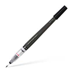
- Some watercolour illustrators also like to add some fine line details with a Sakura Pigma Micron Fineliner or Winsor & Newton Fineliner Black - Set of 5 liners.
For more instructions on Creating a landscape in Watercolour check out our earlier blog: Creating a landscape in Watercolour.
The most important rule to remember is to enjoy the process of being outside and connecting with nature. Lots of small studies are just as valuable as a large finished piece.
What Will I Need? - Basic Toolkit and Equipment
Below is a list of some suggested items that would make your painting experience a great one!
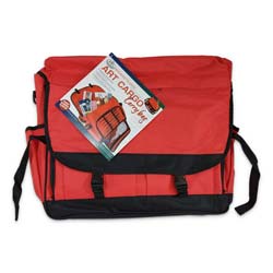
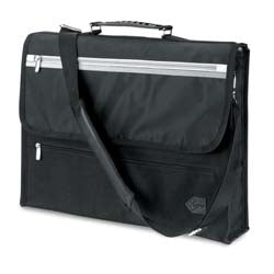
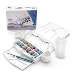
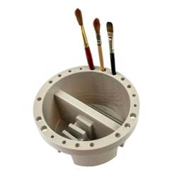
Carrying and Storage Bags
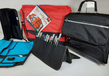
Being prepared and organised is half the battle of leaving the comfort of your home! Listed below are storage ideas for your equipment.

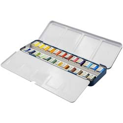
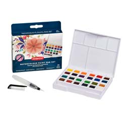
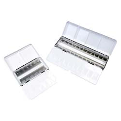
Watercolour Paint Pan Sets
These sets below are ideal for working en plein air. They are compact, lightweight and all come with their own palette.

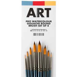
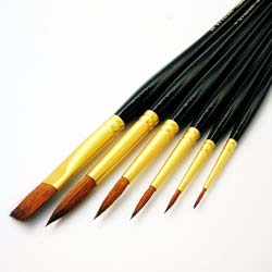
Watercolour Brushes
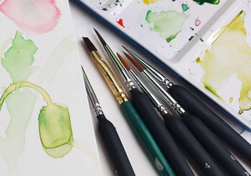
When painting outside you will only need a few brushes, Mop, wash or large flat brushes are good for covering large backgrounds, but you don’t need all of them! A medium or smaller round brush will provide a point for details while a small or medium flat will provide you with a great edge for buildings, tree trunks, tall masts, and any geometric shapes.

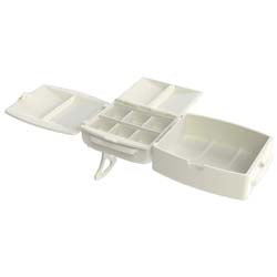
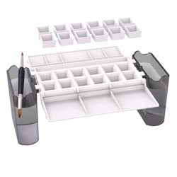
Palettes for Paint Tubes and Half Pans
If you already own tubes of watercolour paints, some of these palettes below will allow you to decant them and store them safely. If you own several half pans without a home, we have empty tins with palettes for storage too!

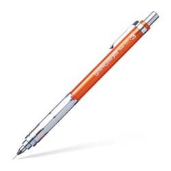
Mechanical and Automatic Pencils

The beauty of these pencils is you don’t need a sharpener! The fine lead will provide a consistent thin line, ideal for drafting out your watercolour painting.


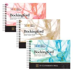
Watercolour Sketchbooks, Pads, and Artboards
The paper you use is very important especially if you like to use a lot of water techniques. The list below includes several sizes of sketchbook, artboard and paper pads. The aim when painting outdoors is to only take the paper you will use, so plan wisely so you don’t have to carry unnecessary weight. Keep to paper that is over 200gsm. The surface texture is completely up to you, smooth HP, rough CP, or medium NOT.


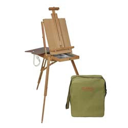
Portable/Field Easels

There’s really nothing like sitting outside at a park or by a lake and painting what you see, and field easels are the perfect option for the artist who wants a stable work surface. These lightweight easels fold to a compact size that’s perfect for travel.


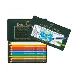
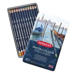
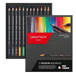
Watercolour Pencils
Watercolour Pencils can be used to create tonal ranges and are great for drafting out your composition or adding finishing details over your watercolours.

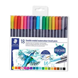
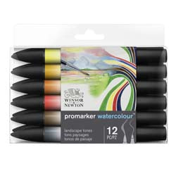
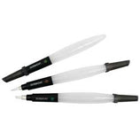
Watercolour Pens
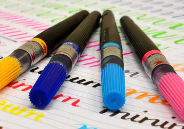
These watercolour pens are great for drafting out your image before committing to your paints. You don’t have to use too much pressure as they are highly pigmented and will blend away when diluted.
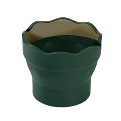
Travelling Waterpots
As the name might suggest, water is quite important when painting with watercolours. These compact pots are perfect for containing water when you're working en plein air.


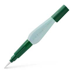
Water-Brushes and Spritzers
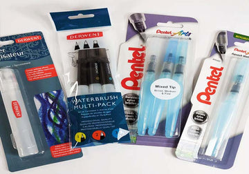
Want to avoid bringing a water pot with you? Water-brushes eliminate the need for a pot entirely, as you can fill them up and squeeze the water out when needed. They're a great option for those who want to lighten their load.

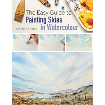
Watercolour Tutorial Books
We have compiled this list of amazing books that will help prepare you for your plein air adventures.


Want to see even more Plein Air products? Check out the Plein Air Collection at ARTdiscount.
Shop Here