Your Cart is Empty


'Colouring the Nation' - A beginners guide; how to use a colour wheel.
"Colour is my day-long obsession, joy, and torment." Claude Monet
Using a colour wheel to plan a painting involves understanding the relationships between different colours and how they can be combined to create visually appealing and harmonious artworks. Here are the steps and merits of using a colour wheel for planning a painting.
This blog aims to clarify why an informed approach to colour mixing will enhance your paintings so you can create more of a convincing, realistic or fantasy landscape, seascape or figurative study.
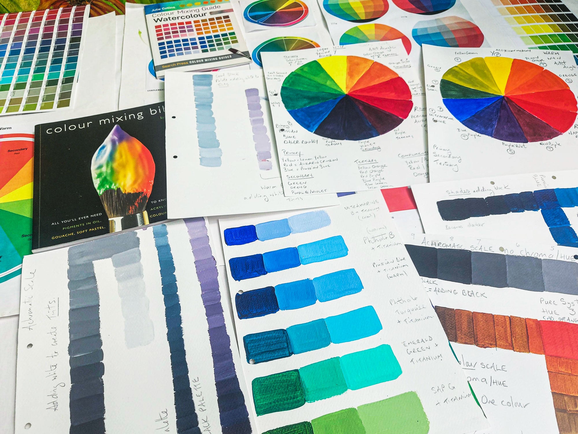
There are many colour charts, colour wheels and theories around colour, for this particular article we will look at Sir Isaac Newton’s colour wheel, which is made up of 12 sections.
Creating colour charts and investigating mixing techniques will help you to develop a greater understanding of how you can manipulate colour to create the language of a painting that is entirely yours and uniquely you!
Creating a colour wheel
To create a Newton’s colour wheel you will need to draw out a circle with 12 equal sections. We created two colour wheels, first one was created using a cool palette of primary colours, alizarin crimson, lemon yellow and Prussian blue.
The second colour wheel was created with a warm set of primary colours; naphthol red light, ultramarine blue, and azo yellow. Having a warm and cool set of primary colours has its advantages. Creating a good purple using the warm primary colours usually results in a more muted neutral colour. Whereas using the cool set of primary colours will result in a more vibrant purple colour.
Place all primary colours down on your chart equally distanced apart. Use the colour straight from the tube or pan, if using watercolour paint or acrylic paint, dilute with a small amount of water. However the more pigmented and less diluted the paint mix is, the more vibrant the colour will be.
To create a secondary colour, mix in equal proportions 50/50 a yellow with a blue to create green, a red with a yellow to create orange, and a red with a blue to create purple. Paint your secondary colour in the portion of your pie chart that is directly in the middle of your primary colours.
To create a tertiary colour, split your secondary colour into two portions, add more yellow to one portion to make a yellow-green, then add more blue to the other portion to make a blue-green. Paint these tertiary colours either side of your secondary colour, in between your primary and secondary. Continue to mix up your tertiary colours from your secondary colours to extend your tertiary palette.
Cool and warm primary colour wheel

Explanation of the colours on Newton’s colour wheel


| COLOUR | CATEGORY | COLOUR | CATEGORY |
|---|---|---|---|
| Yellow | Primary | Purple | Secondary |
| Yellow-Orange | Tertiary | Blue-Purple | Tertiary |
| Orange | Secondary | Blue | Primary |
| Red-Orange | Tertiary | Blue-Green | Tertiary |
| Red | Primary | Green | Secondary |
| Red-Purple | Tertiary | Yellow-Green | Tertiary |
Steps to use a colour wheel
Understand the colour wheel basics:
Primary colours: Red, blue, and yellow. These colours cannot be created by mixing other colours.
Secondary colours: Green, orange, and purple. These are created by mixing two primary colours.
Tertiary colours: These are created by mixing a primary colour with a secondary colour, such as red-orange, blue-green,etc.
Warm colours are identified as; yellow, yellow-orange, orange, red-orange, red and red-purple.
Cool colours are identified as; yellow-green green, blue-green, blue, blue-purple and purple.
Explore colour relationships:

Image courtesy of https://www.wikiart.org/en/paul-cezanne/curtain-jug-and-fruit-1894
Complementary colour palette:
Colours opposite each other on the wheel (e.g. red and green, yellow and purple, and orange and blue). They create strong contrast and can make elements stand out. Used close together can make each of the colours seem brighter.
Paul Cezanne used this palette to paint ‘Curtain, jug and fruit in 1894’. Reds and green hues resonate off the canvas, the muted tones of the jug, curtain and background wall also helps to create visual contrast.
Complimentaries

Cobalt blue and orange heavy body acrylic paint.

Medium yellow and velvet purple heavy body acrylic paint.

Sap green and cadmium red deep hue heavy body acrylic paint.

Claude Monet’s ‘Water Lilies 1908’ are a good example of a harmonic palette. Image courtesy of https://www.wikiart.org/en/claude-monet/water-lilies-29
Analogous colour palette:
Colours next to each other on the wheel (e.g. blue, blue-green, and green).
They create harmonious and serene compositions. Examples of analogous colour schemes would be, shades of green, blue and turquoise, or shades of blue, lilac and mauve, or shades of reds, oranges and yellows.

A Row of Poplar Trees Line The River Epte – Painted by Claude Monet, 1819 Poplars (Monet Series)
Triadic colours:
Three colours evenly spaced around the wheel (e.g. primary triad palette; red, yellow, and blue or a secondary triad palette orange, purple and green or tertiary triad palette; yellow-orange, red-purple and blue-green…).
They provide a balanced and vibrant colour scheme. A good example of this can be seen in Monet’s Impressionist painting "Poplars on the Banks of the Epte", 1891. Green, Purple and Orange. The thick impasto of Monet’s paint provides transitions of jewel-like colours and textures moving from warm to cool.
Our eyes optically mixes these rich hues to provide us with Monet’s painting of fleeting light, and the warmth of the day; the language of the Impressionists.
Split-Complementary Colours: A base colour and the two colours adjacent to its complementary colour (e.g., blue with yellow-orange and red-orange or yellow with red-purple and blue purple). This scheme offers high contrast with less tension than complementary colours.
Tetradic (Double-Complementary) Colours: Two complementary colour pairs (e.g., red and green with blue and orange). This scheme offers rich colour diversity and balance.
Monochromatic Colour Palette: Different shades, tints, and tones of a single colour. This creates a cohesive and subtle look. Using light tones of a single colour will create a relaxed fresh feel, whilst using darker tones of a single colour can create interest, drama and feel moody.
Pablo Picasso’s painting in his Blue period ‘The Soup’ is a good example of just how powerful the use of colour is to illustrate an emotion or portray the mood of a painting.

Images courtesy of Wikipedia.org
Choose a colour scheme:
Based on the mood, theme, or subject of your painting, select a colour scheme that aligns with your vision. For example, use complementary colours for dynamic contrast or analogous colours for a calming effect. Remember warm colours advance and cool colours recede into the distance. Monochromatic palettes can be calming or mood evoking.
Plan your palette:
Once you have chosen a colour scheme, mix your paints to create a palette that includes the main colours and their various shades, tints, and tones. This helps in maintaining consistency throughout your painting.
Apply the colours:
Use the colour wheel as a reference while you paint to ensure that the colours you are using are harmonious and balanced. Adjust as necessary to achieve the desired effect.
Merits of using a colour wheel
1. Harmony and balance:
The colour wheel helps in selecting colours that work well together, ensuring that your painting is harmonious and visually appealing.
2. Contrast and emphasis:
By understanding complementary colours, you can create strong contrasts that draw attention to specific areas of your painting, adding emphasis and interest.
3. Mood and emotion:
Different colour schemes can evoke different moods and emotions. For example, warm colours (reds, oranges, yellows) can create a sense of warmth and energy, while cool colours (blues, greens, purples) can evoke calmness and tranquility.
4. Visual interest:
Using a variety of colour schemes, such as triadic or tetradic, can add complexity and richness to your painting, making it more engaging.
5. Consistency and cohesion:
Planning your colours in advance helps maintain consistency and cohesion throughout your artwork, preventing colours from clashing or appearing out of place.
6. Creative exploration:
The colour wheel encourages experimentation with different colour combinations, helping you discover new and creative ways to use colour in your paintings.
Efficiency:
Having pre-planned colour plaette based on the colour wheel can streamline your painting process, making it more efficient and less time-consuming.
In summary, using a colour wheel is an essential tool for artists to create visually compelling and balanced paintings. It guides the selection of colours, helps achieve the desired emotional impact, and enhances the overall aesthetic of the artwork. Having a purposeful colour palette will also save you time and expense.
Mixing colour on your palette
Creating a lighter colour is known as a tint;
Tint: A colour mixed with white, resulting in a lighter version of the original colour. Varying degrees of white pigment added to the mix, will create a palette of pastel colours. Any colour can become a tint when white is added.


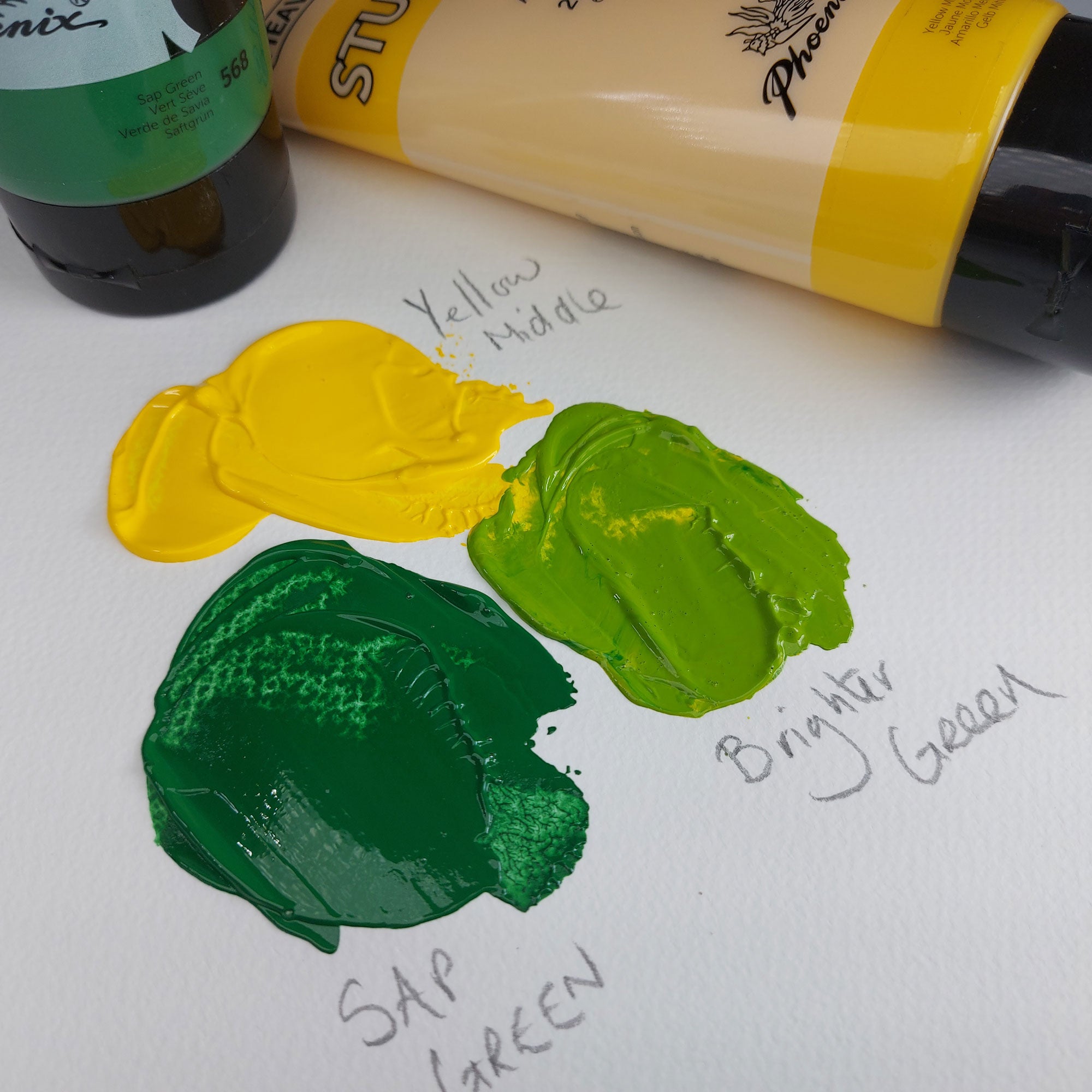
Creating a brighter colour;
To create a brighter colour you can add either lemon yellow or cadmium yellow rather than white. This will create a more vibrant colour rather than a pastel colour.

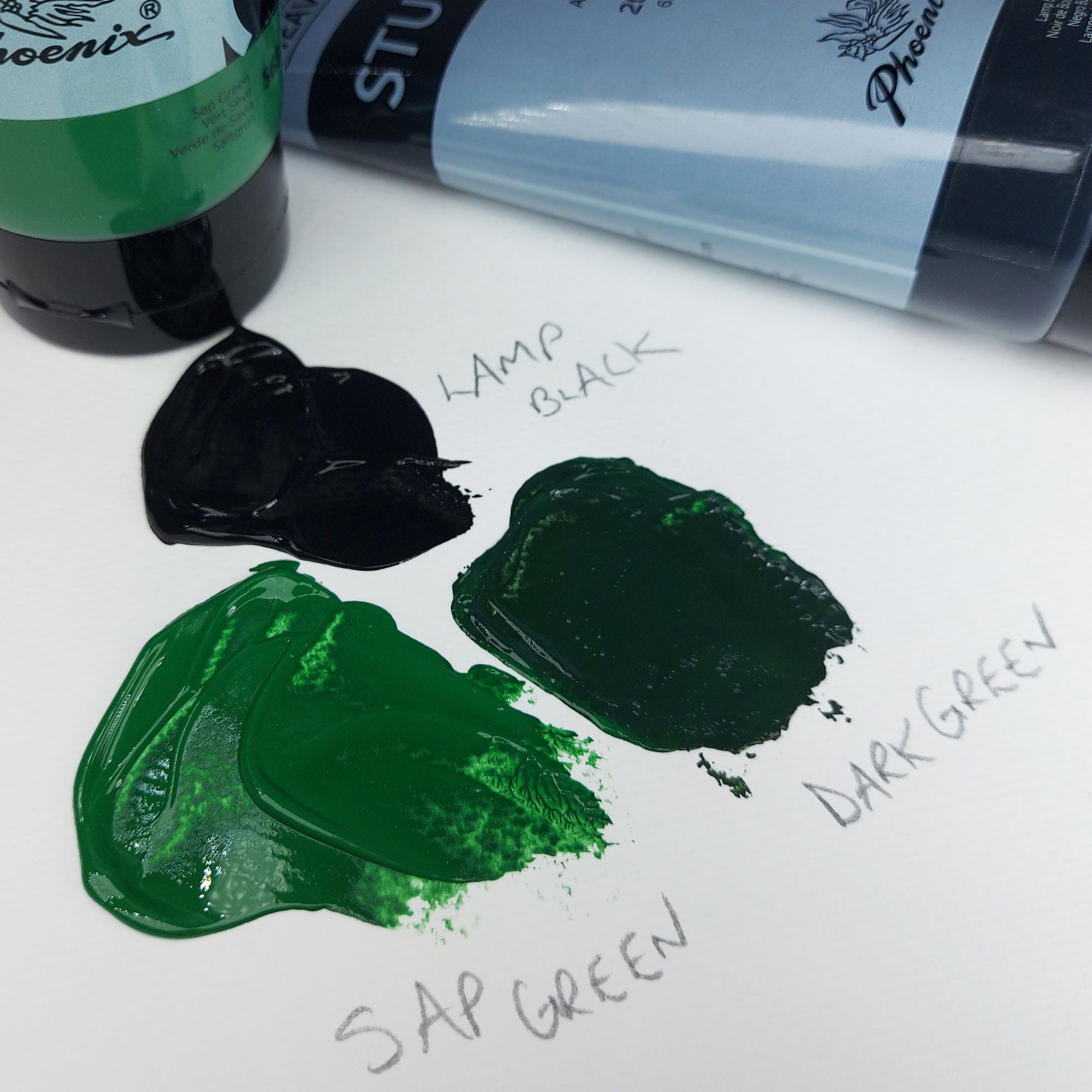
Creating a darker colour is known as shade;
Shade: A colour mixed with black, creating a darker version of the original colour. Aim to add black to the original colour in small increments, as you can very quickly overpower your original colour and darken it too much.

Creating a duller more subdued colour is known as a tone;
Tones: A tone is created when grey is added to the original hue to create a darker or muted, less intense alternative without changing its hue. Varying proportions of grey can be added to the mix to create different tones light or dark. In this context grey is made from mixing
To create this toned down red we made a grey from titanium white and lamp black first, then added a small amount to the scarlet red until we arrived at our desired muted tone.


Mixing complementary colours to create a darker more muted tone.
Mixing a complementary colour in small increments to the original colour whill result in a dull hue. Try an 80/20 ratio, or less if you wish to just take the blue down a notch.
Here we added a very small amount of orange to the blue and produced a subdued darker blue hue.

Creating neutral tones.
To create a neutral colour, or an earth tone, we still used our two complementary colours, orange and light blue but in a 50/50 ratio to create a neutral brown earth colour. To create a lighter brown or a warm grey, you could add a very small amount of white.

Value: Refers to the lightness or darkness of a colour. Values help to define form and add dimension to artwork. When using a photographic reference image it is advisable to have a black and white version as well as a coloured version to ascertain how bright, light or dark the colours are in relation to each other. Using a value chart will help you to mx the correct intensity of dark and light.

In conclusion, understanding colour theory is essential for any beginner artist looking to enhance their creative work. By mastering the principles of primary, secondary, and tertiary colours, as well as the harmonious use of the various colour schemes, artists can elevate their compositions to new heights. At ARTdiscount, we are passionate about supporting your artistic journey with top-quality and expert advice. Embrace the power of colour theory, and let your creativity shine with vibrant, balanced, and dynamic artworks. Happy painting! Don’t forget to share your journey with us #colouringthenation.
Further colour mixing books and guides:
- A little guide to help you mix colours! Pocket guide to mix colour.
- Colour mixing guide- Watercolour.
- Pocket Colour Wheel.
- 3000 Colour Mixing Recipes: Watercolour - J. Collins
- Artist's Colour Wheel - Mixing Guide - Large (23.5cm Diameter)
- The Colour Mixing Companion by Julie Collins - Hard Cover
- Colour Mixing Bible - I. Sidaway