Your Cart is Empty

Let's talk about colour red
“You can’t go wrong with the use of red; every painting should have red in it” - George De Groat
In this article we will talk about the power and impact the colour red has in the visual world and how it is perceived. We will also look at some famous and inspiring red paintings by well known artists.
The second article will explain the difference between warm reds and cool reds, thus making colour mixing and creating tonal ranges in your artwork easier. We will provide easy links to our red paint products for ease of purchase.
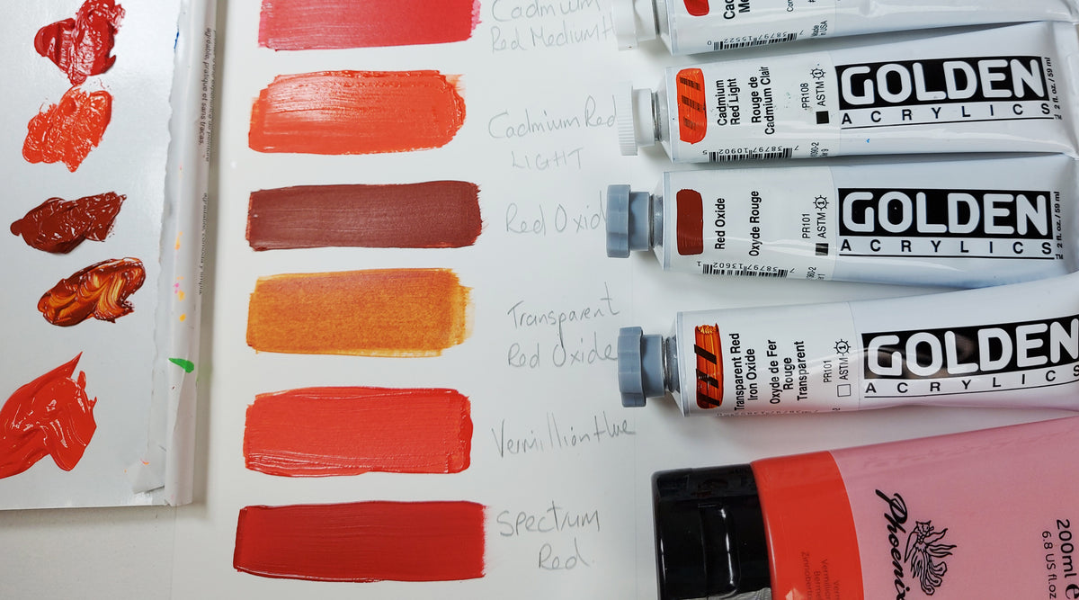
When we remember our first introduction to ‘Colour Theory’ we all learn that the colour ‘red’ is a primary colour; It cannot be mixed by two other colours to make this perfect hue! We can, however, create many variations of Red just by mixing it with the right colour combination depending on if we wish to lighten, darken, brighten or desaturate your colour!
In this article we briefly look at how the colour red is perceived in society and what it means to some. Whether we realise it or not we are compelled by the colour red to act and feel in a certain way, so firstly we will look at colour psychology and symbolism, then move onto signs and brands that are familiar to us in our everyday lives. We will conclude by looking at famous paintings in art and some of the many products we can offer you to advance your understanding of the potential of the colour red in your own work…
“I want a red to be sonorous, to sound like a bell. If it doesn’t turn out that way, I add more reds and other colours until I get it” Pierre - Auguste Renoir
Colour psychology and symbolism
Red more than any other colour on the spectrum has more emotional associations and cultural references.
We associate the colour red with heightened emotions such as love, passion, lust, strength, power, danger, rage, heat and in some countries good luck and fortune. The colour red is worn for marriage ceremonies in China and India to symbolise good fortune, good luck and good health.
The colour red can actually stimulate our bodies, increasing heart rate and blood flow, and can increase our appetites.
We associate red with stop and danger signs and traffic lights that alert us to stop and pay attention. Red fire engines alert us to danger, fire and rescue.
The cosmetic industry relies on us loving the colour red in as many shades as you can think of so they can produce lipsticks, nail polish and blush. Especially around Valentine's day, when we also give red roses to the ones we love.
Red is associated with luxury items and products such as a red Ferrari declaring your financial status. Louboutin with iconic red soles oozes wealth and success, whilst Valentino gowns shout, sophistication and seduction.
The Red Cross looks after our health, while Johson & Johnson supplies us with the right products. Red logos we have all grown up with.
Red is a very hardworking colour in many ways. It is used professionally and commercially to capture attention, elicit emotion and convey confidence.
Red can represent royal and religious authority in ceremonial robes. Celebrities at the award ceremonies get to walk down the 'red carpet'.
Red logos and brands
Because the colour red conveys power, strength, energy and can generate strong emotions, the brands below have embraced this ethos and most have never changed the original colour! The list below is not exhaustive. Red can be clearly seen in the food industry in packaging, the healthcare industry through logos, the film industry and in the travel industry. Mostly memorable and unforgettable.
“If one says ‘Red’ – the name of colour – and there are fifty people listening, it can be expected that there will be fifty reds in their minds. And one can be sure that all these reds will be very different” - Josef Albers, German

“Painters use red like spice” - Michael Derek Elworthy
Famous red paintings to inspire your creative journey
Caravaggio ‘Saint John the Baptist in the Wilderness’
Caravaggio portrays Saint John the Baptist as a young man, lost in the wilderness, physically and emotionally. He had painted this theme many times before maintaining his strong and recognisable style, with his use of chiaroscuro and emotionally charged figures. The red cloak became a constant prop in many of Caravaggio’s paintings. Painted with a striking realism.
This image was based on the statement in the Gospel of Luke that:
“The child grew and was strengthened in spirit, and was in the desert until the day of his manifestation to Israel.”

“Saint John the Baptist in the Wilderness” by Caravaggio painted 1605
John Singer Sargent ‘Dr Pozzi at Home’
This portrait of Dr Pozzi at Home was the first work Sargent exhibited at the Royal Academy in London in 1882. Dr Pozzi was a pioneer in the field of modern gynaecology in France, he was also a surgeon, writer, patron of the arts and an anthropologist, travelling the world collecting artefacts of antiquity. He was also a senator and served for three years representing his native Bergerac. He served as a military surgeon in two wars and during active service in 1918 during the First World War he was murdered by a deranged former patient. Dr Pozzi remained a good friend and patron of Sargent’s work throughout his life. He was greatly admired and respected by Sargent and by many dignitaries.

John Singer Sargent Dr Pozzi at Home 1881
This mutual respect between these two great influential figures is evident in the way Sargent has styled and painted the charismatic Doctor Pozzi. He is posed in lush crimson red robes almost ecclesiastical in nature, in front of a deeper red velvet backdrop. Sargent focused on his long and elegant hands referencing his surgical prowess, with a standing pose denoting refinement and sophistication. Dark and warm rich reds of the backdrop, contrasting against even warmer brighter red hues.
Vincent van Gogh 'The Red Vineyard’
Vincent van Gogh painted the 'Red Vineyard' after an evening walk through the vine harvest in Arles in the South of France. In a letter to his brother written on November 6th 1888 he refers to the vineyard as looking like red wine in the sunset! The workers are mainly dressed in blue and compliment the colour palette Van Gogh has chosen. The sky is gold yellow which is reflected in the water and in the soft distant vineyards. Van Gogh painted this painting in a single day and it was painted from memory. He was greatly inspired by the work and bright colour palette of Paul Gauguin who was staying with him at the time of this painting. This was the only painting Van Gogh ever sold.

Vincent van Gogh - The Red Vineyard 1888
Henry Matise the ‘Red Studio’
Matisse’s painting provides us with a sneak peak into his studio, his personal objects, his personal space and paintings. His studio in reality was not actually red but white. His decision to paint the negative space red was bold and purposeful, it is thought that the original background of the painting was shades of blue, pink and ochre. Matisse may have been resisting the urge to paint a deep spatial reality by painting flat red over the canvas, but the outlines of the furniture aren’t simply decorative, they do in fact describe the narrative and provide us with an unusual perspective of his studio. The red is illuminating the slightly ambiguous space with its rich tones but provides us with the illusion of the floor and the walls of his studio. Venetian Red plays a big part in this painting!

“The Red Studio" by Henri Matisse. Painted in 1911. Oil on Canvas.
Mark Rothko 'No 301'
Mark Rothko was an American abstract painter of Latvian Jewish descent. He is best known for his colour field paintings that depicted glowing, irregular and painterly rectangular regions of colour, which he produced from 1949 to 1970. He was regarded as one of the most influential and prolific abstract painters of the modern era.
It is said that Rothko’s large paintings of a single hue were intended as “dramas” to elicit an emotional response from the viewer. During this period Rothko was very much interested in the viewers experiencing his paintings, connecting with their human feelings and to evoke spiritual emotions. When viewed up close the energetic and chaotic nature of the brush strokes can be seen, when viewed from a distance the illusion of the darker rectangle seems to float over the lighter crimson background.
“Maybe you have noticed two characteristics exist in my paintings; either their surfaces are expansive and push outward in all directions, or their surfaces contract and rush inward in all directions. Between these two poles you can find everything I want to say.” Mark Rothko, 1953

No. 301, as the painting was known, was created in 1959. This famous painting involves the colour red, two different shades of deep crimson. One shade of deep red from edge to edge with a rectangular block of deep red in the centre.
“A red hill doesn’t touch everyone’s heart as it touches mine. . . Badlands [desert] roll away outside my door, hill after hill—red hills of apparently the same sort of earth that you mix with oil to make paint.” - Georgia O'Keeffe
Georgia O’Keeffe ‘Red Hill and Bones’
O’Keeffe had a unique way of painting nature, plants and flowers by exploding their scale, simplifying their shape and forms and using rich saturated colours. She was instrumental in the development of modern art in America, becoming the first female painter to gain respect in New York’s art world during the 1920’s. O’Keeffe lived on Ghost Ranch in Northern New Mexico and became endlessly inspired by the desert landscape, rivers, canyons, mountains, bones and skulls of the dead animals she found, right on her doorstep. O’Keeffe translated her love and deep connection with New Mexico through her paintings, they are filled with a dramatic atmosphere, created using deep, and rich colours and simplified shapes. Beautiful warm red pigments, representing parched earth, heat, life and death.
‘As soon as I saw it, that was my country. I’d never seen anything like it before but it fitted to me exactly. There’s something that’s in the air, it's just different. The sky is different, the stars are different, the wind is different’.

Hopefully you have been inspired by the beautiful paintings above and would like to use more red pigment in your own work, but what do we mean when we say there are ‘warm’ reds and ‘cool’ reds? Stay tuned for the second part of our ‘The colour red’ article.
